
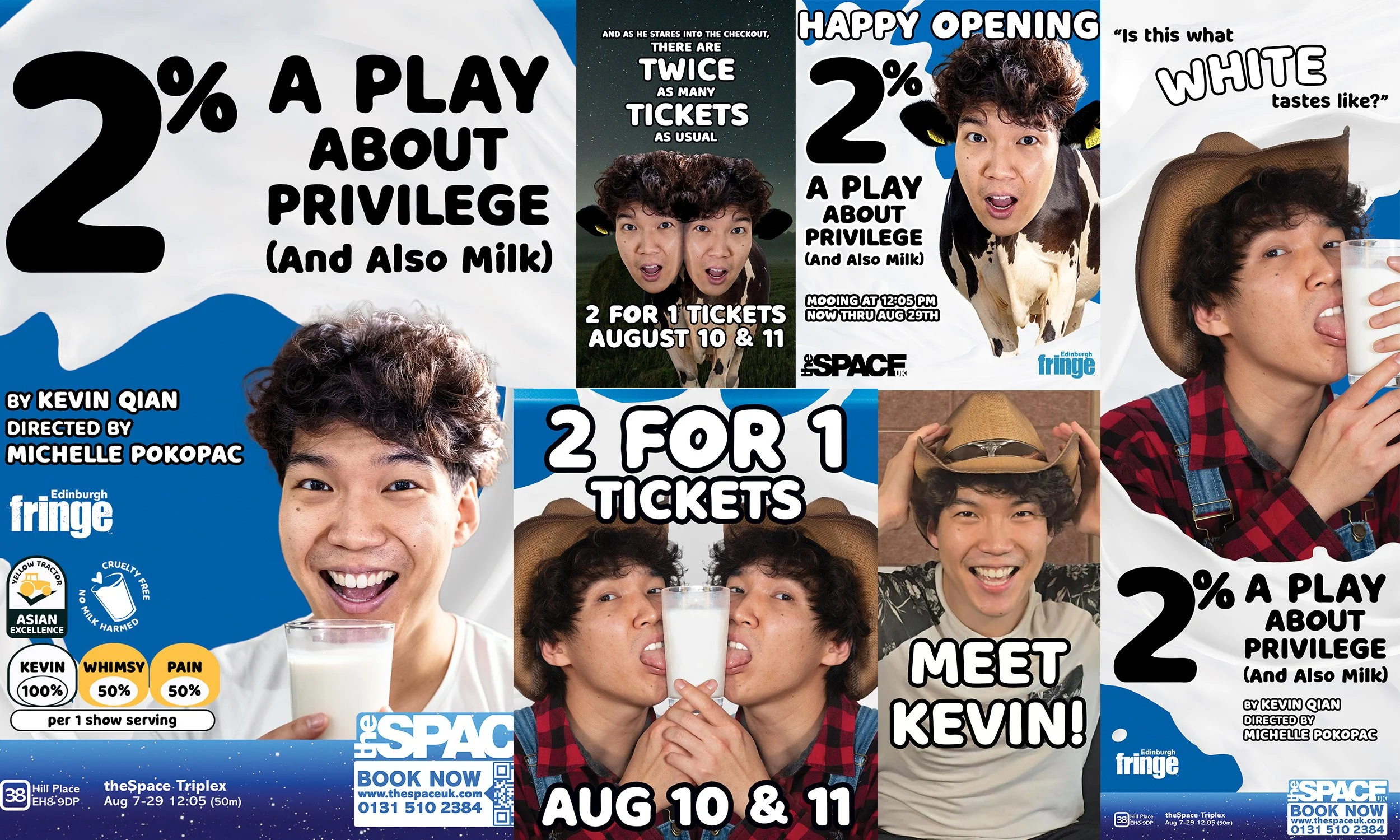
2% A Play About Privilege (And Also Milk)
From Flyer to Fringe
Role: Graphic Designer & Creative Marketing Associate/Strategist
Client: Kevin Qian / 2% A Play About Privilege (And Also Milk)
Production Director: Michelle Pokopac
Producers: Kevin Qian & Michael Hugo Halasnik
Stage Management: Maggie Norsworthy
Photo & Video Refinement: Kevin Qian
Festival: Edinburgh Festival Fringe 2026
Deliverables: Print Design · Social Media · Campaign Photography & Creative Direction · Short-Form Video · Marketing Strategy · Print Production
The Project: 2% A Play About Privilege (And Also Milk) is a solo show written, produced, and performed by New York-based artist Kevin Qian. Qian recounts his childhood growing up in the American South as the son of Chinese immigrants, exploring race, privilege, identity, and the Asian American experience through comedy, storytelling, and drinking copious amounts of milk.
Qian initially brought me onto the production to design a two-sided promotional flyer for its 2026 Edinburgh Festival Fringe debut. As the project developed, so did my role, growing from that initial flyer into a suite of print and digital campaign materials, promotional photography, short-form video, and contributions to the production’s social media and marketing strategy in direct collaboration with Qian and his production team.
The Goal: Build on the show’s existing identity while creating a cohesive campaign that would introduce Kevin’s story to new audiences and stand out at the world’s largest performing arts festival.
The Challenges:
Evolve an existing visual identity for a new international production while retaining the elements most important to the artist.
Balance tone and subject matter, communicating a show that explores race, privilege, identity, and assimilation through comedy…and a lot of milk.
Stand out in an exceptionally crowded market, where thousands of Fringe productions compete for audience attention.
Adapt a cohesive campaign across multiple formats, each with different dimensions, requirements, purposes, and tight production deadlines.
Starting with a Glass Half-Full
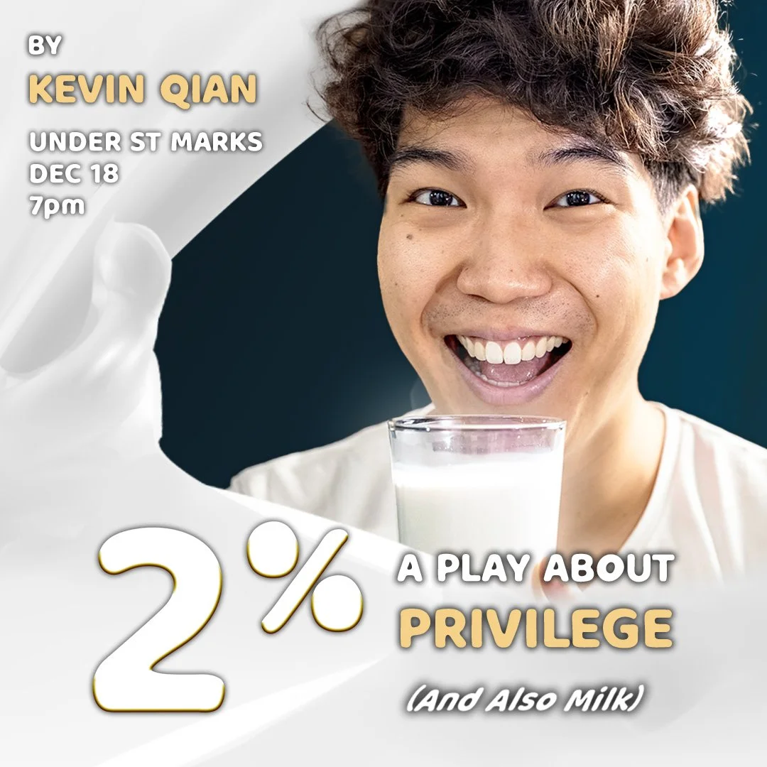
Prior to the Edinburgh run, Qian hosted a staged reading of his early draft of 2% in New York in December 2025. Promotional materials from the reading established the foundation of the show's visual identity, including its typography, color palette, and key imagery. Rather than starting from scratch, my task was to identify which elements were essential to 2% and determine how they could evolve for Edinburgh.
Following conversations with Qian and his production team, this is WHAT WE KEPT:
Kevin + Milk: The smiling image of Qian with a glass of milk was a must—eye-catching, playful, and immediately suggestive of the show’s comedic milk motif.
Splashing Milk: The milk wave connects literally to the show’s milk-chugging and metaphorically to the waves of assimilation into whiteness surrounding Kevin.
Title Hierarchy: Maintaining emphasis on the 2% title while playing with the scale of the subtitle remained integral to Qian’s vision.
WHAT NEEDED TO EVOLVE:
Legibility
Readability
Greater Color Impact
Stronger Visual Hierarchy
The Big Idea: Put Kevin on the Carton
Flyering is both a key marketing strategy and a long-standing tradition at Edinburgh Fringe. With thousands of A6 flyers handed to passersby every day of the festival, ours needed a distinctive look that could stand out in a crowded environment while making practical, effective use of every inch of printed space.
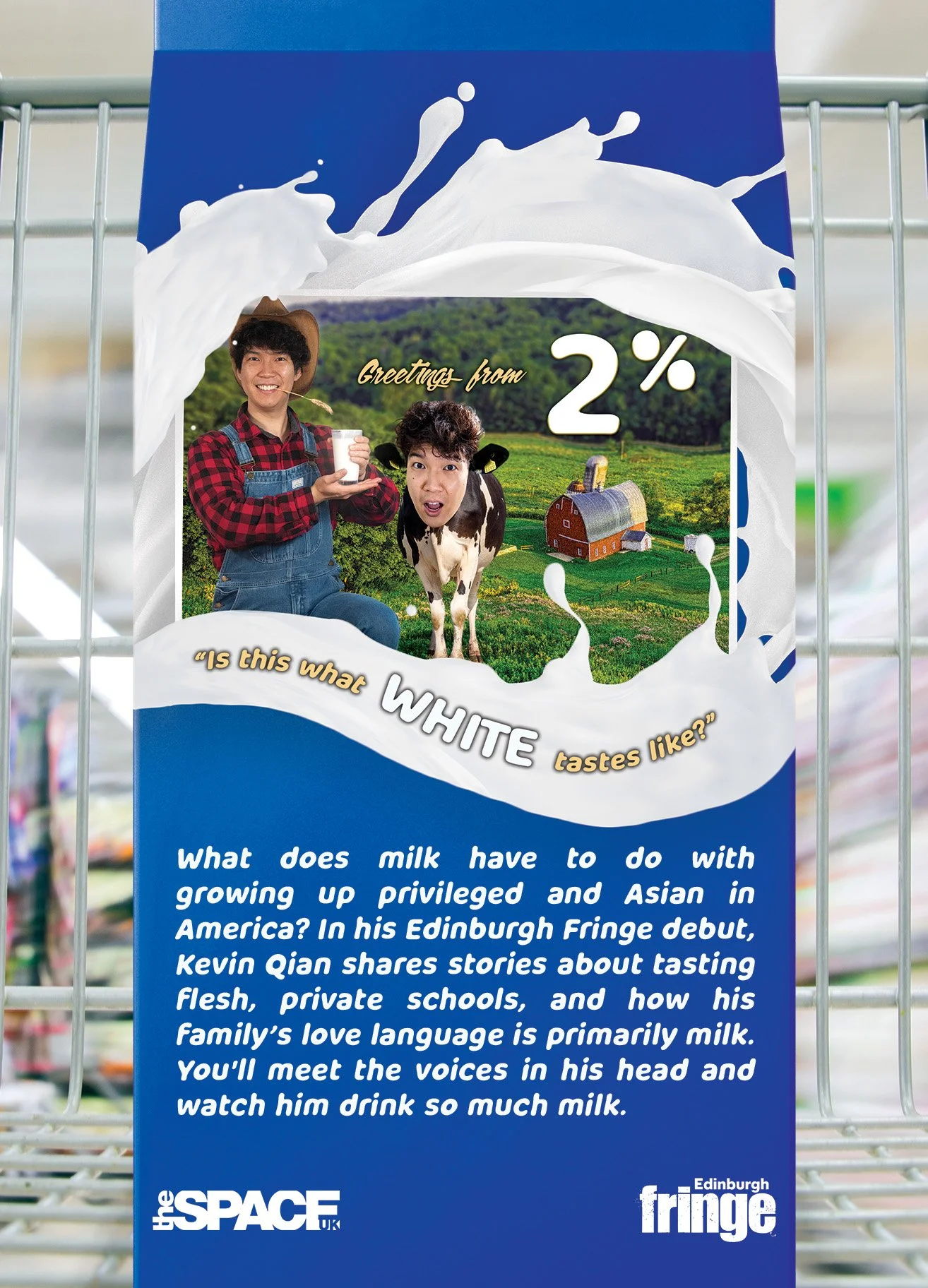
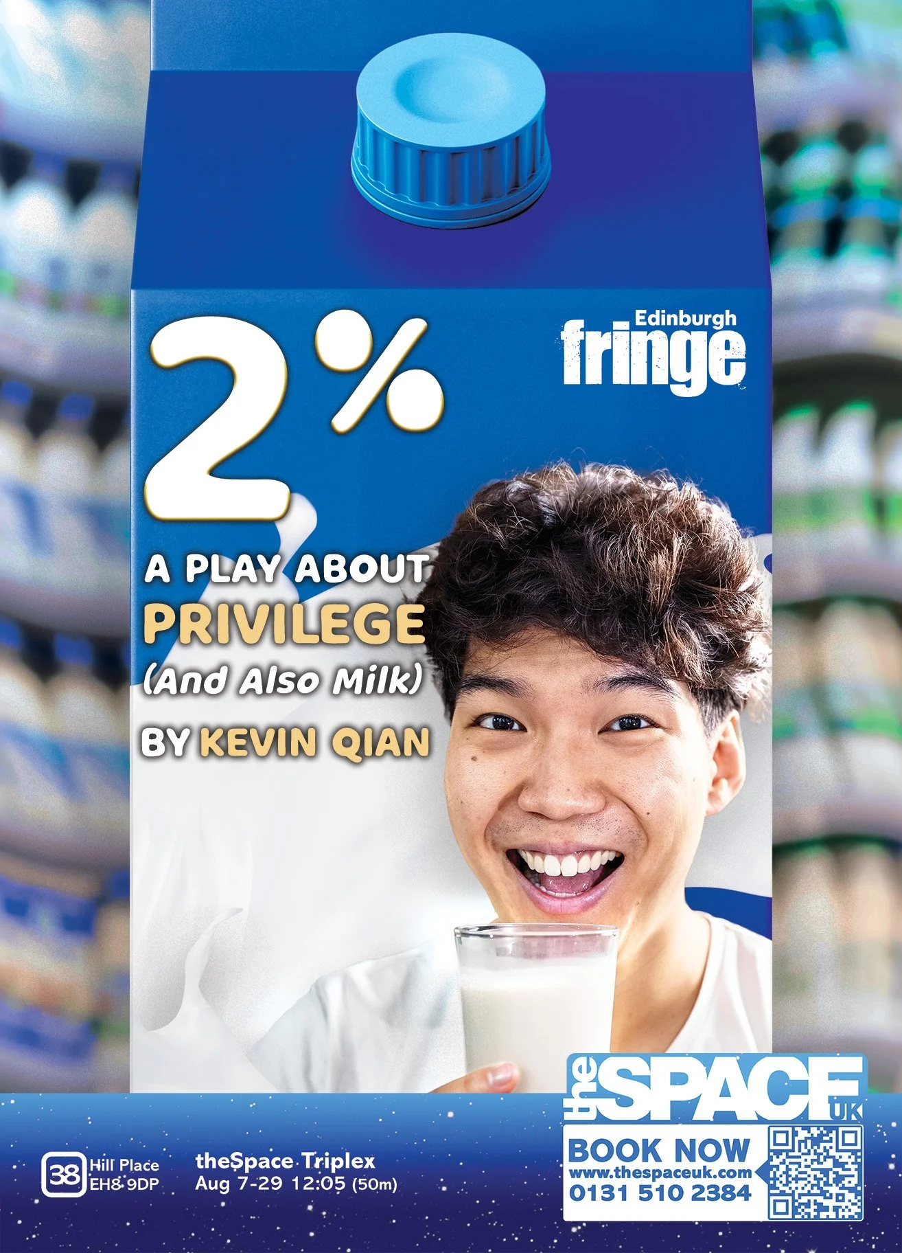
In 2%, Qian transforms into Kevin the Cow, a milk-drinking bovine being sold by an unseen, unnerving farmer (also voiced by Qian) during the show’s “2% Roadshow.” The image of Kevin himself becoming a product, combined with the show’s farm setting and ever-present milk cartons, inspired me to extend the story into the flyer itself.
With the campaign heading to Edinburgh, I also wanted the concept to feel locally recognizable. The flyer therefore draws from the visual language of UK supermarket milk packaging, something Fringe audiences might encounter on a Tesco shelf, reimagined as Kevin's own brand of 2% milk.
⟡ Flyer Final Design & A3 Poster
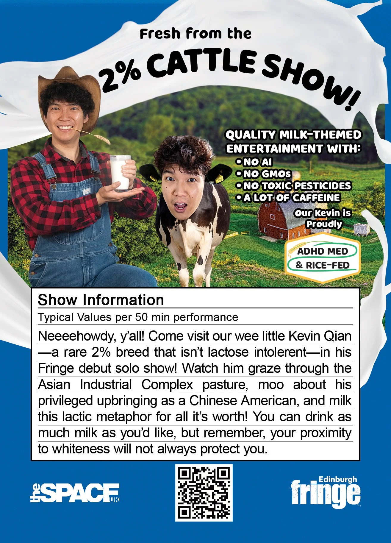
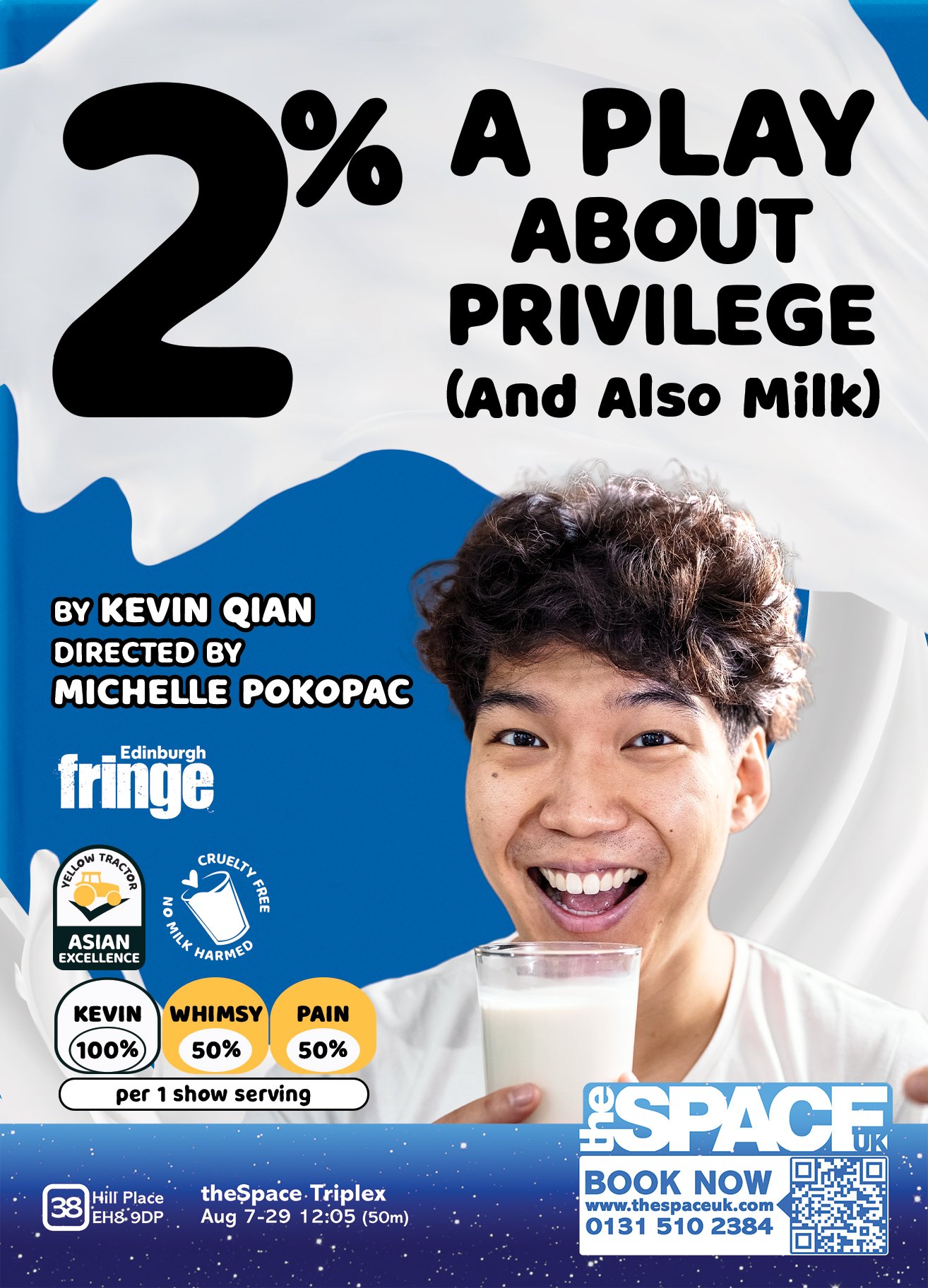
Following feedback and revisions with Qian, I refined the flyer to place greater emphasis on the two most important elements of the show’s branding: Kevin’s face and the 2% title, while retaining the strongest elements of the milk-carton concept.
On the front, I removed the supermarket-aisle background to give Kevin and the show information more breathing room. The title placement was carefully adjusted with Qian’s feedback, using the wave of milk to lead the eye from Kevin’s face upward to 2%. On the back, I removed the shopping cart and placed the show summary inside a familiar nutrition-label-inspired box, with additional nods to the color-coded nutritional information found on UK packaging on the front of the flyer. A highlight of features such as “NO AI” and “A LOT OF CAFFEINE” also references key nutritional draws often viewed on product packaging.
Additional Details Worth Milking:
Yellow Tractor: A parody of the UK's Red Tractor food-assurance mark becomes a stamp of “Asian Excellence.”
ADHD MED & RICE-FED: A nod to the “grass-fed” beef certifications customized to Kevin the Cow’s diet.
No Cruelty to Milk: A cruelty-free packaging parody references the show's line, “No milk was harmed in the making of this show.”
QR/Barcode: Ticket access sits where a shopper would expect to find a product barcode.
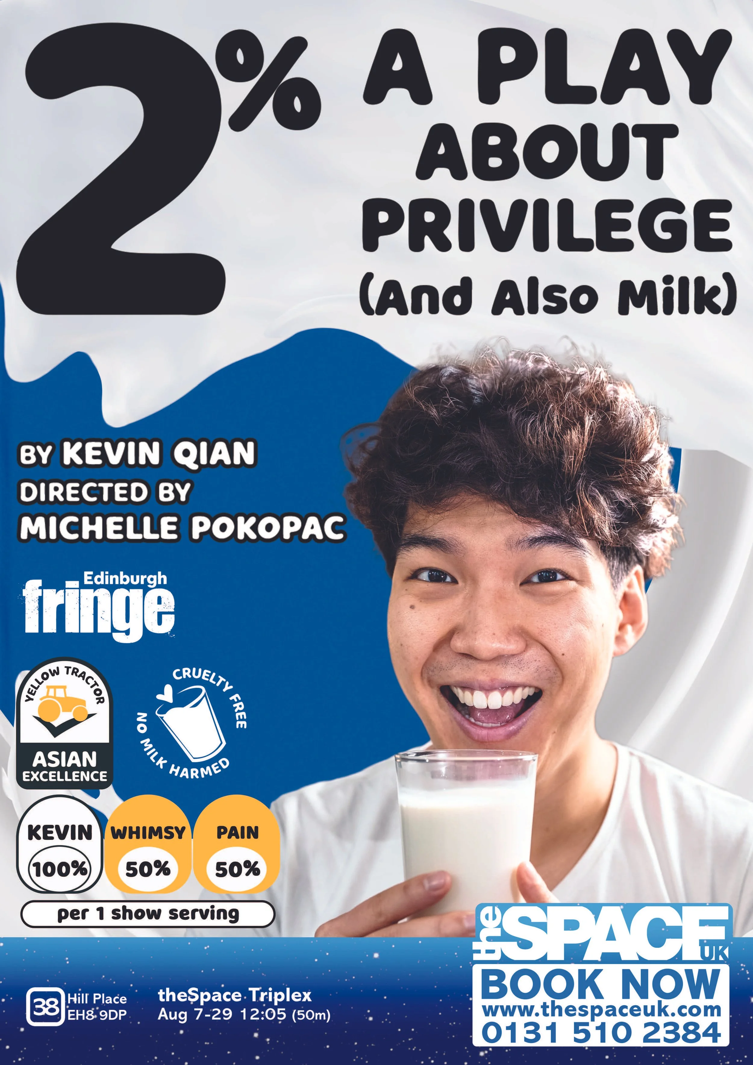
Following approval from both Qian and the venue, the A3 sized poster was created for larger displays at the venue. It was ultimately decided by Qian and me that there was no need to reinvent the wheel for the poster due to the strength of the main flyer design. The design of the front of the flyer was recreated with minor adjustments for the slight increase in printed space in order to maintain visual consistency. If the poster on the building matches the flyer in their hand, our viewers definitely know they are in the right place!
It’s getting Hot (Milk) in Here…
⟡ 12-Sheet/Window Vinyl & Half-Page Brochure Ad
With the flyer complete, additional advertising purchased through the venue gave Qian and me an opportunity to push the campaign’s visual identity further.
One of those placements was a square on the venue’s 12-sheet/window vinyl. The specifications permitted only imagery and the show title, challenging us to distill 2% into a single arresting visual capable of catching attention from the street.
Qian and I developed four concepts:
Option 1: Placing the smiling Kevin image from the flyer/poster design with the title on a spatter of milk. This option was simple, clean, and retained our established imagery.
Option 2: Kevin the Cow (or “Cowvin,” my Photoshop magnum opus, as I called him throughout the process) on the warped farm. Certainly a man's head on a cow's body is bizarre enough to make a passerby stop and stare.
Option 3: The Milk Carton translated the flyer design onto a three-dimensional carton, making Kevin's fictional 2% milk feel almost like a real product. The bright yellow, an established but previously underused campaign color, also offered an opportunity to command attention from the street.
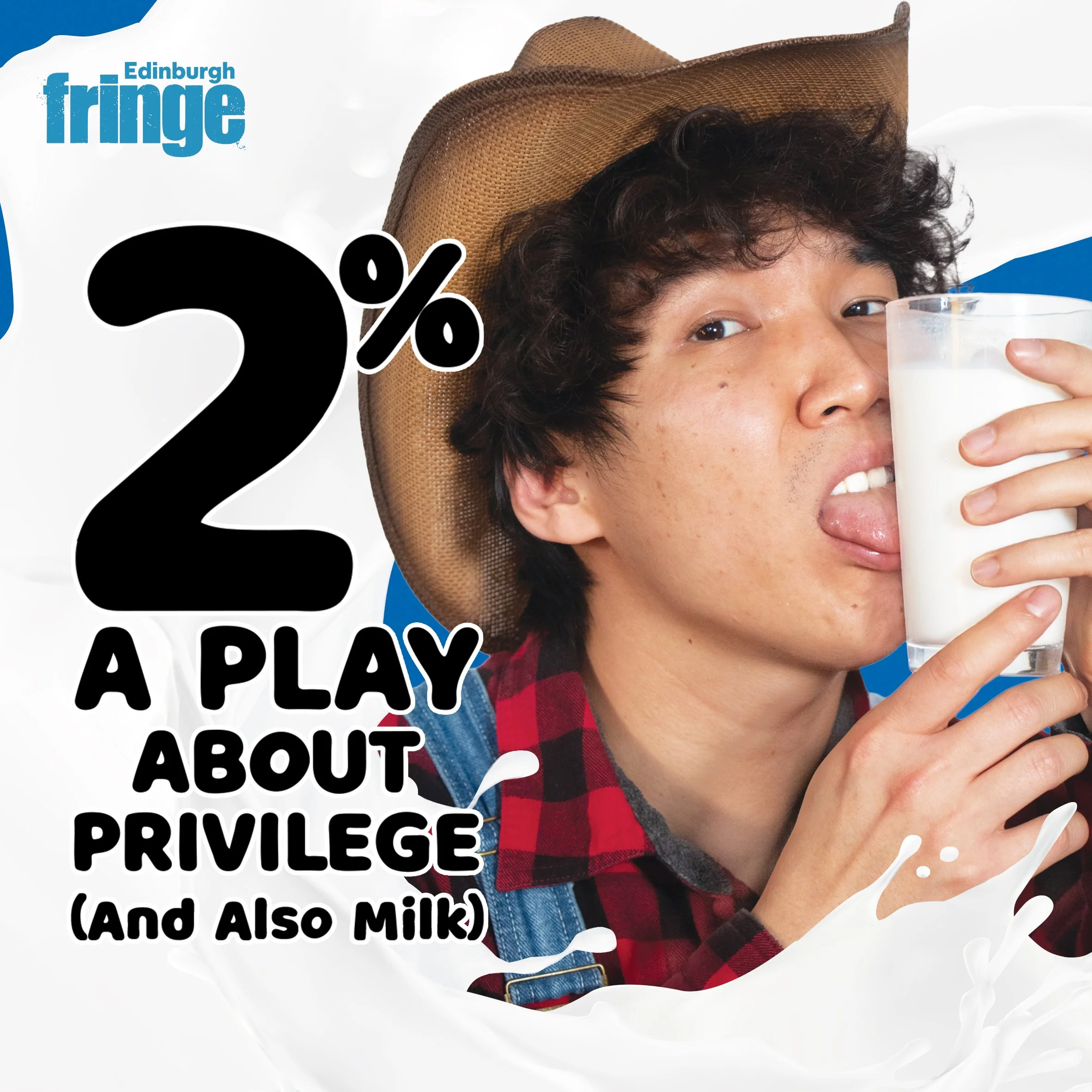
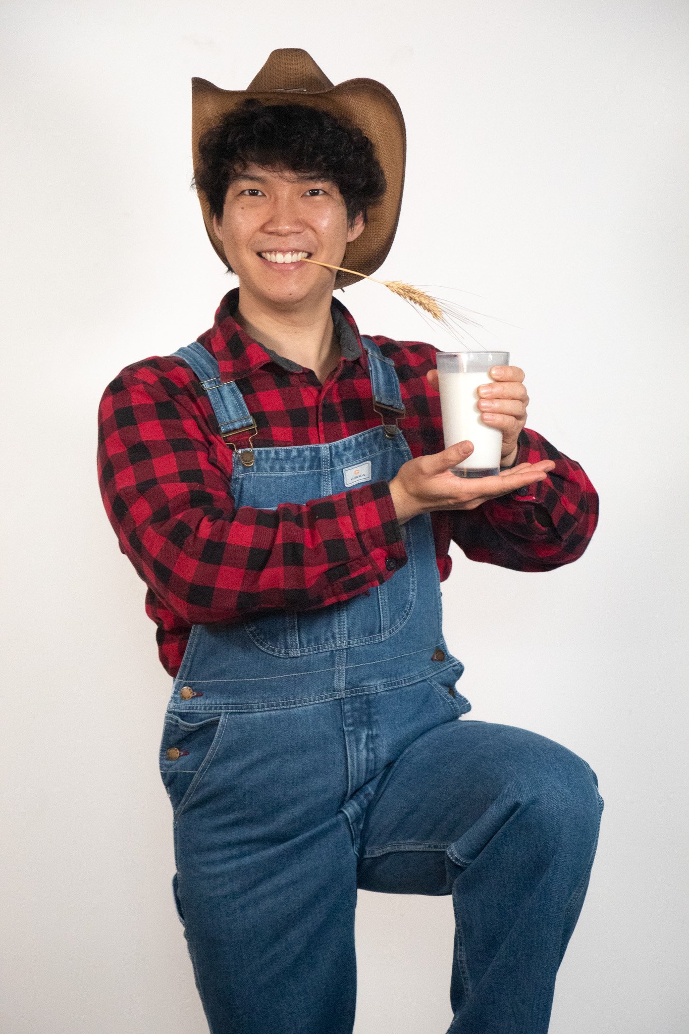
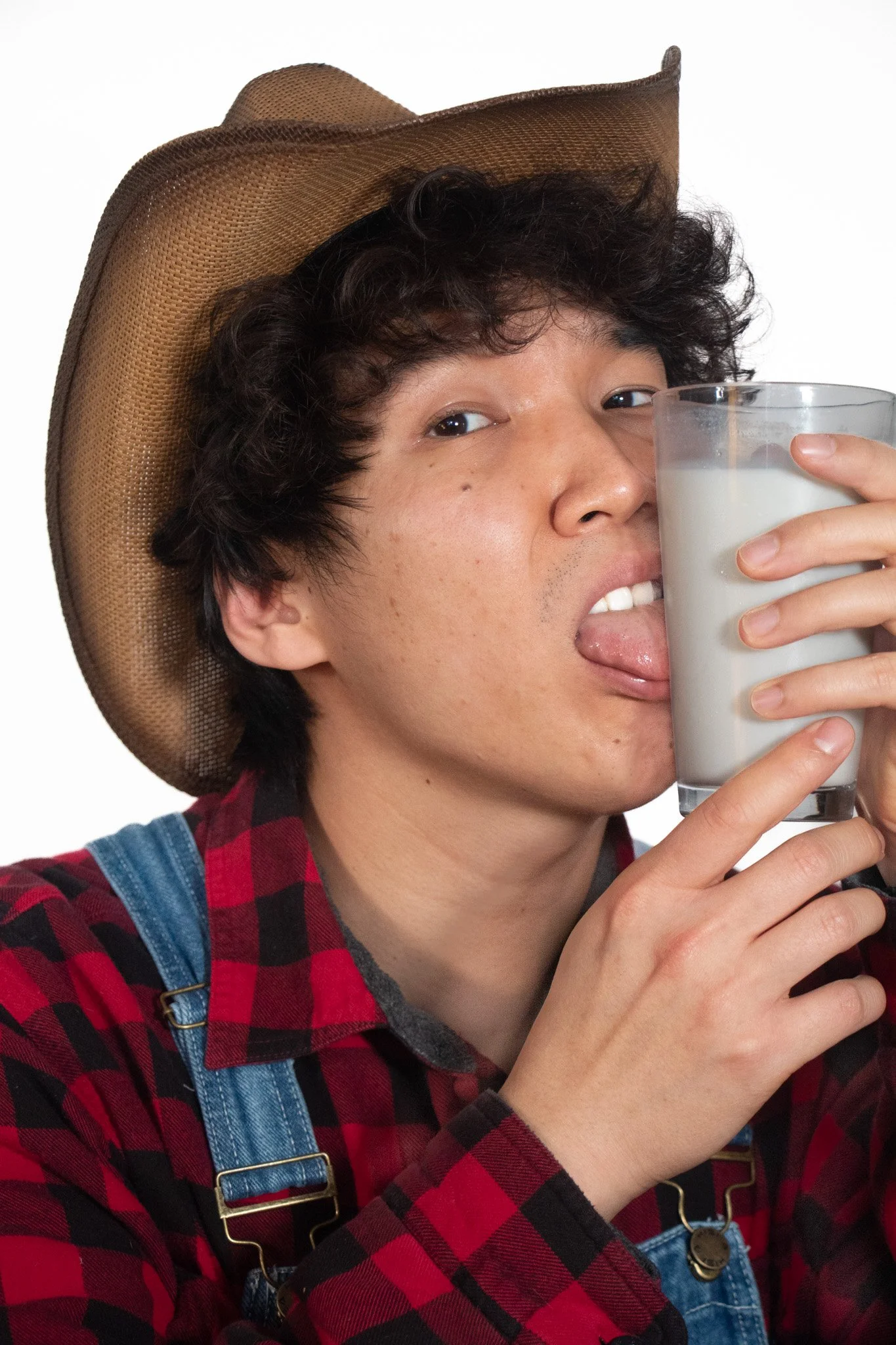
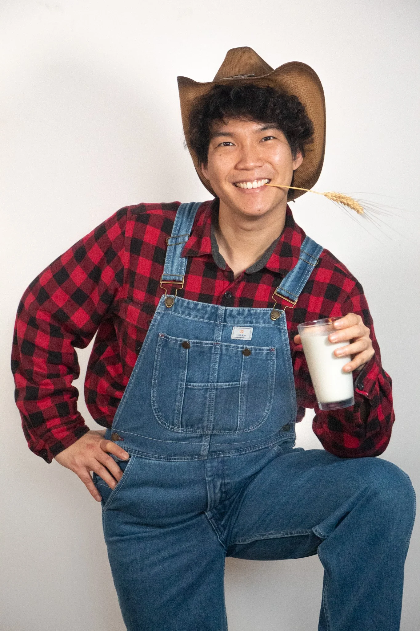
Option 4: “Spicy” Farmer Kevin came from a campaign photoshoot I directed and photographed with Qian dressed as the show’s farmer. The unexpected combination of Kevin, cowboy attire, and an intimate pose with the glass of milk gave us our most provocative option. In Qian’s words: “Sex sells.”
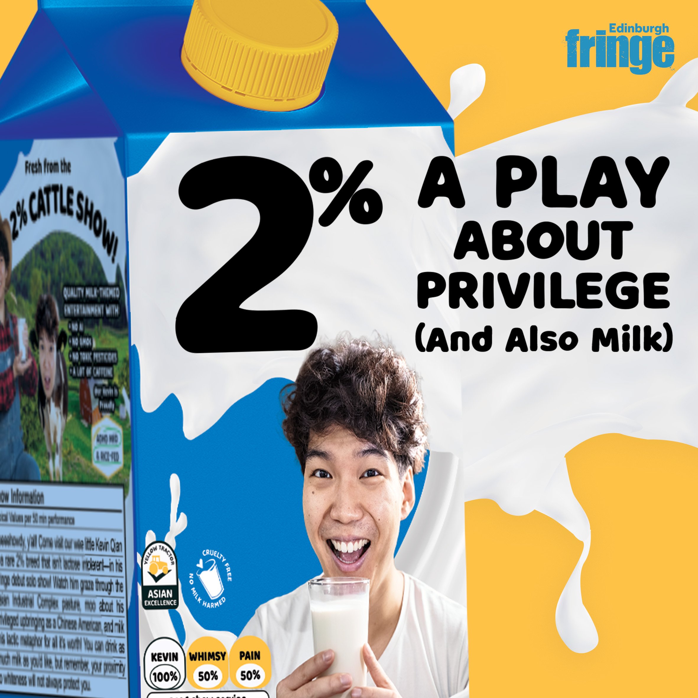
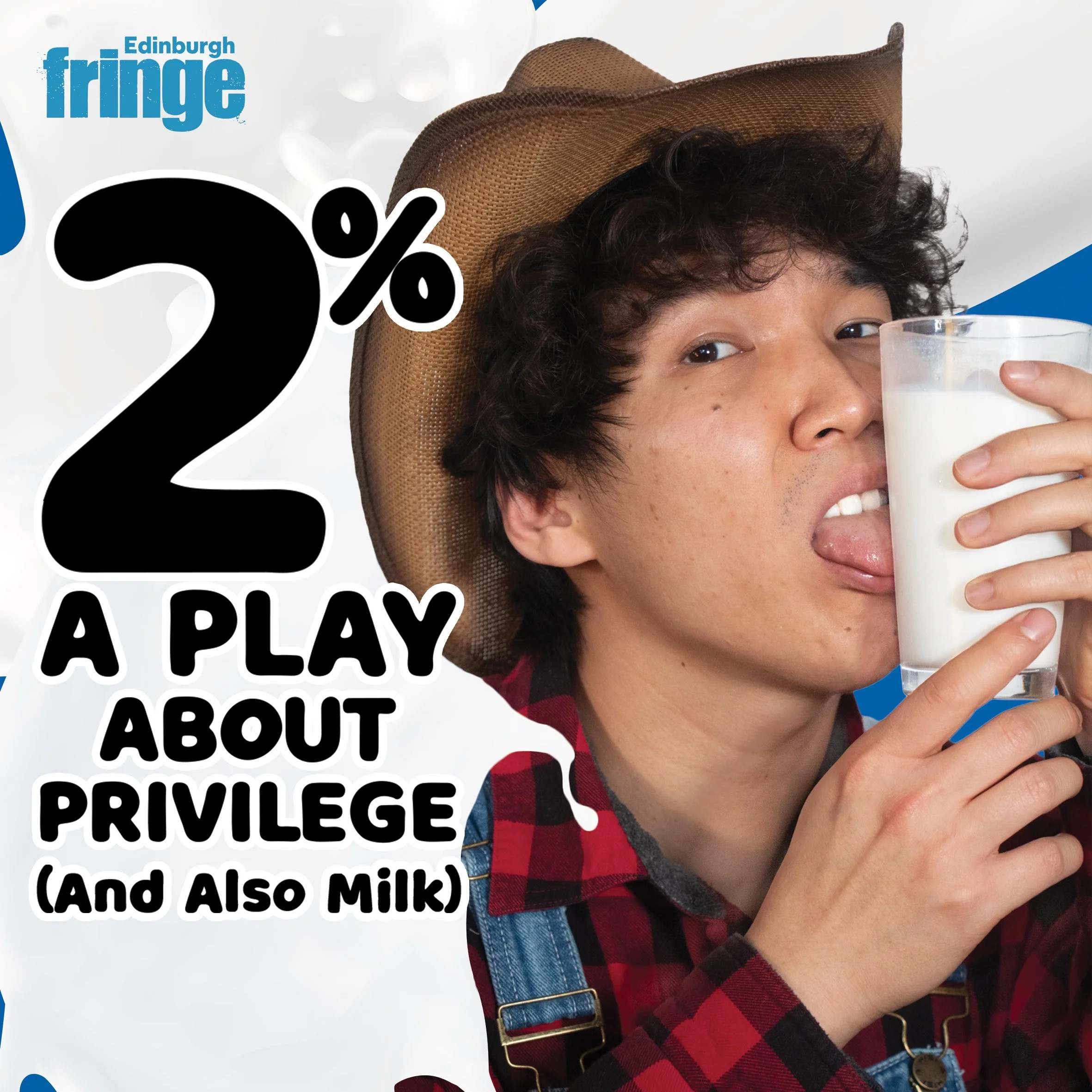
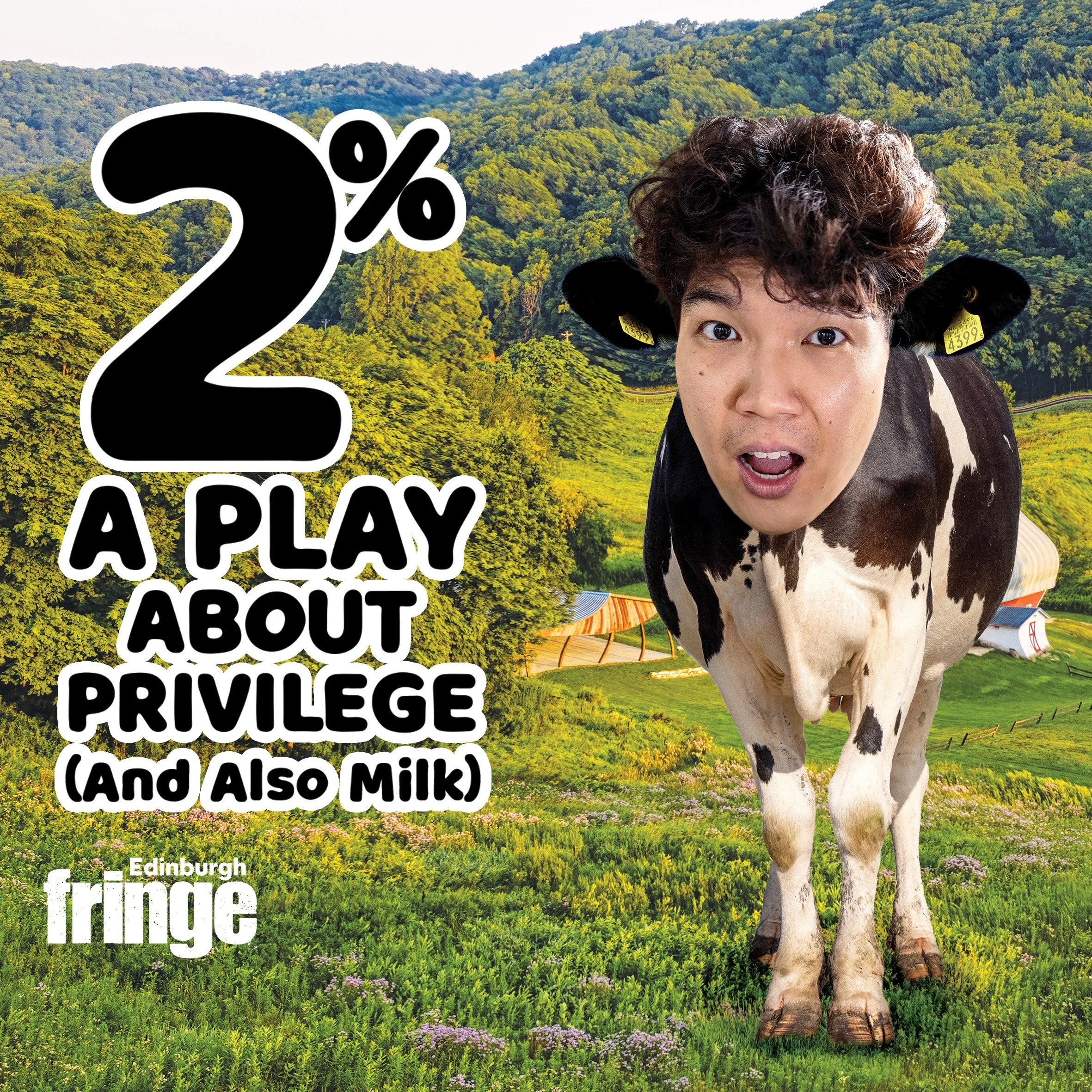
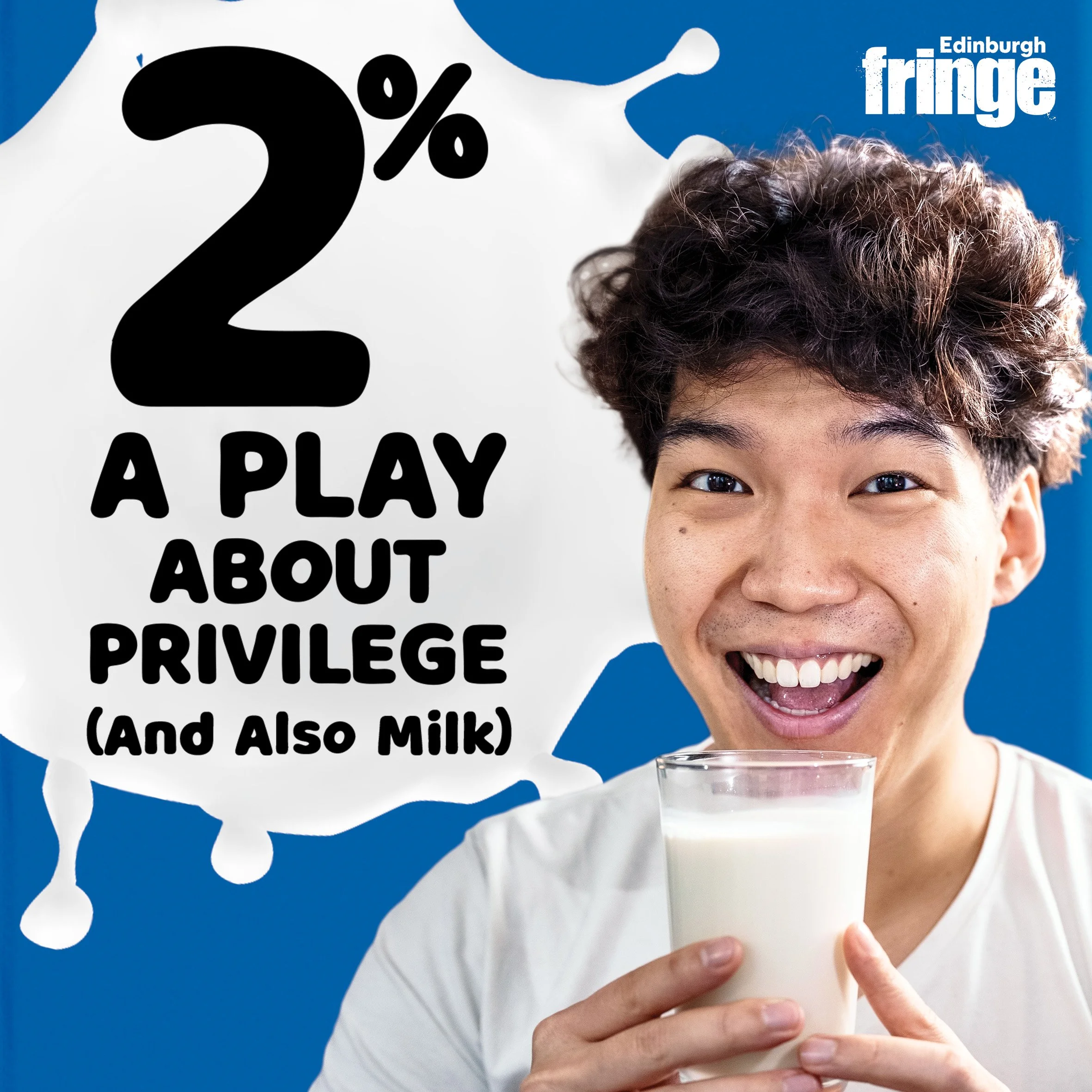
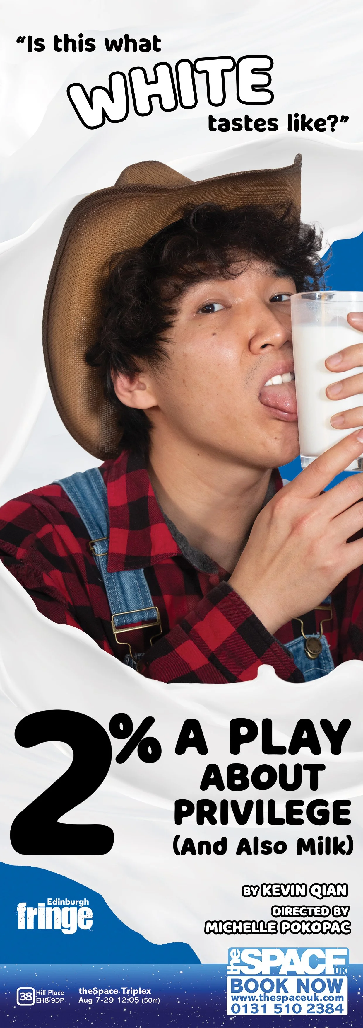
Option 4 ultimately could not be denied. The uncomfortable, provocative, and absurd image of Farmer Kevin intimately embracing a glass of milk was exactly the kind of out-there visual that could fit in at Fringe while still standing out. The final composition uses cascading milk to frame Qian’s face and hands, while the bold black title creates immediate contrast and recognition from the street. The finished window vinyl became one of the campaign's most recognizable visual assets—both on the streets of Edinburgh and, eventually, online.
The same provocative image carried into the venue’s half-page brochure advertisement, paired with the equally provocative (and visually complementary) line from the show: “Is this what white tastes like?” The vertical milk swirl frames both the quote and Farmer Kevin while guiding the eye down toward the title and required venue banner.
Instagram Designs
As the campaign expanded into social, I translated the visual identity established in print into flexible formats that could keep the production recognizable while responding to different promotional needs throughout the Fringe run.
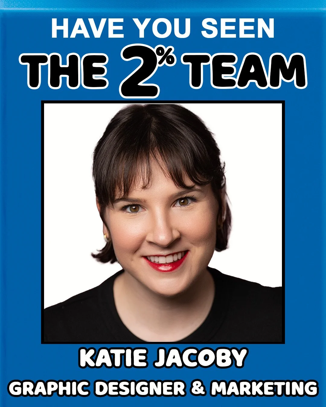
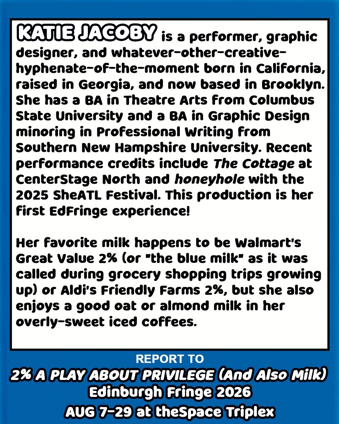
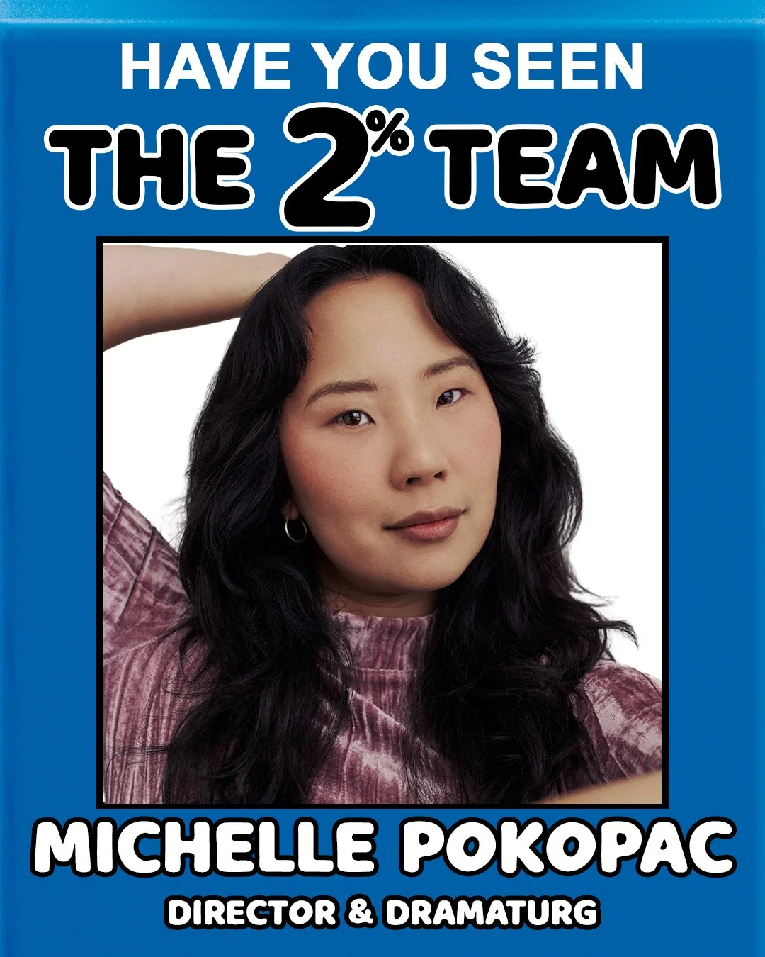
For the team introduction series, I collected a headshot and short biography from each collaborator and extended the milk-carton concept into carousel posts inspired by the missing-person notices once printed on cartons, giving each team member their own moment while maintaining a consistent campaign identity.
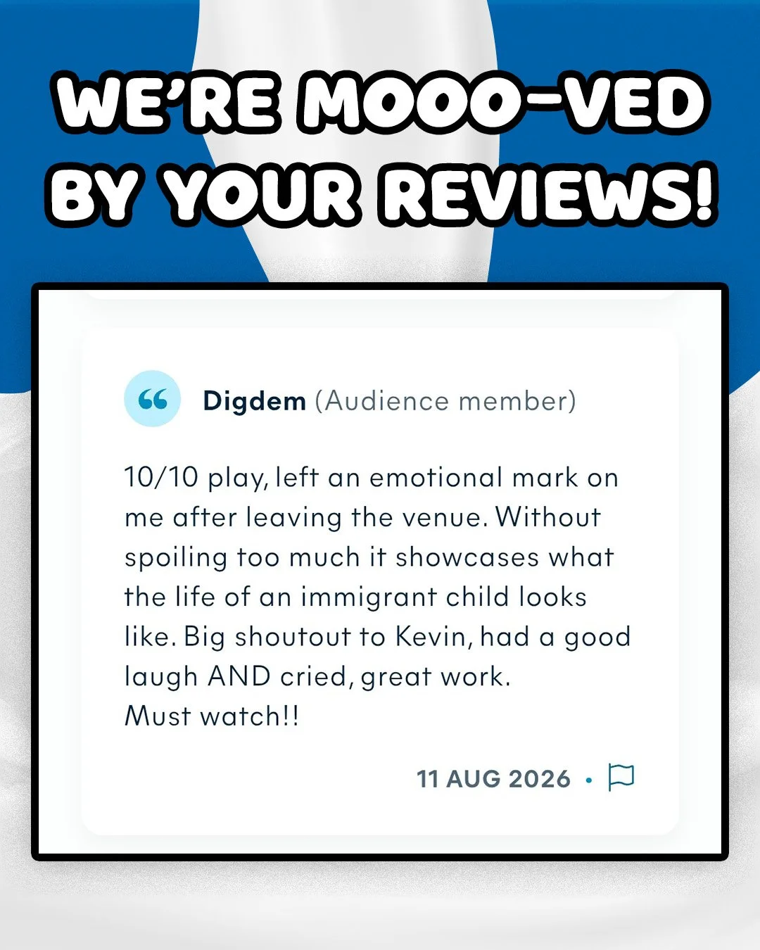
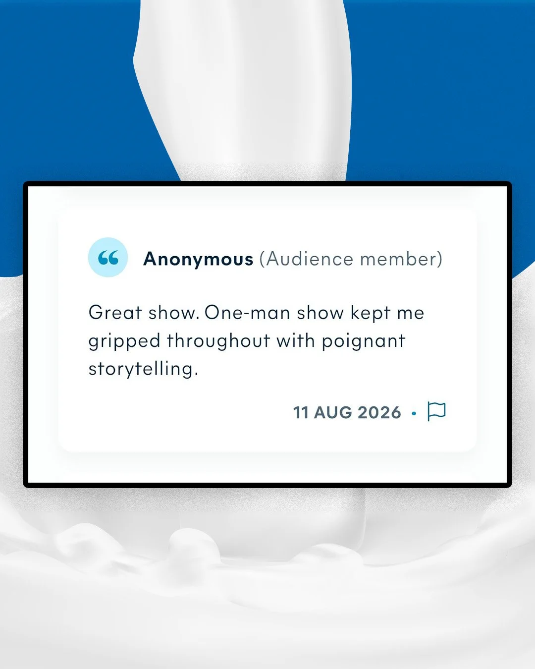
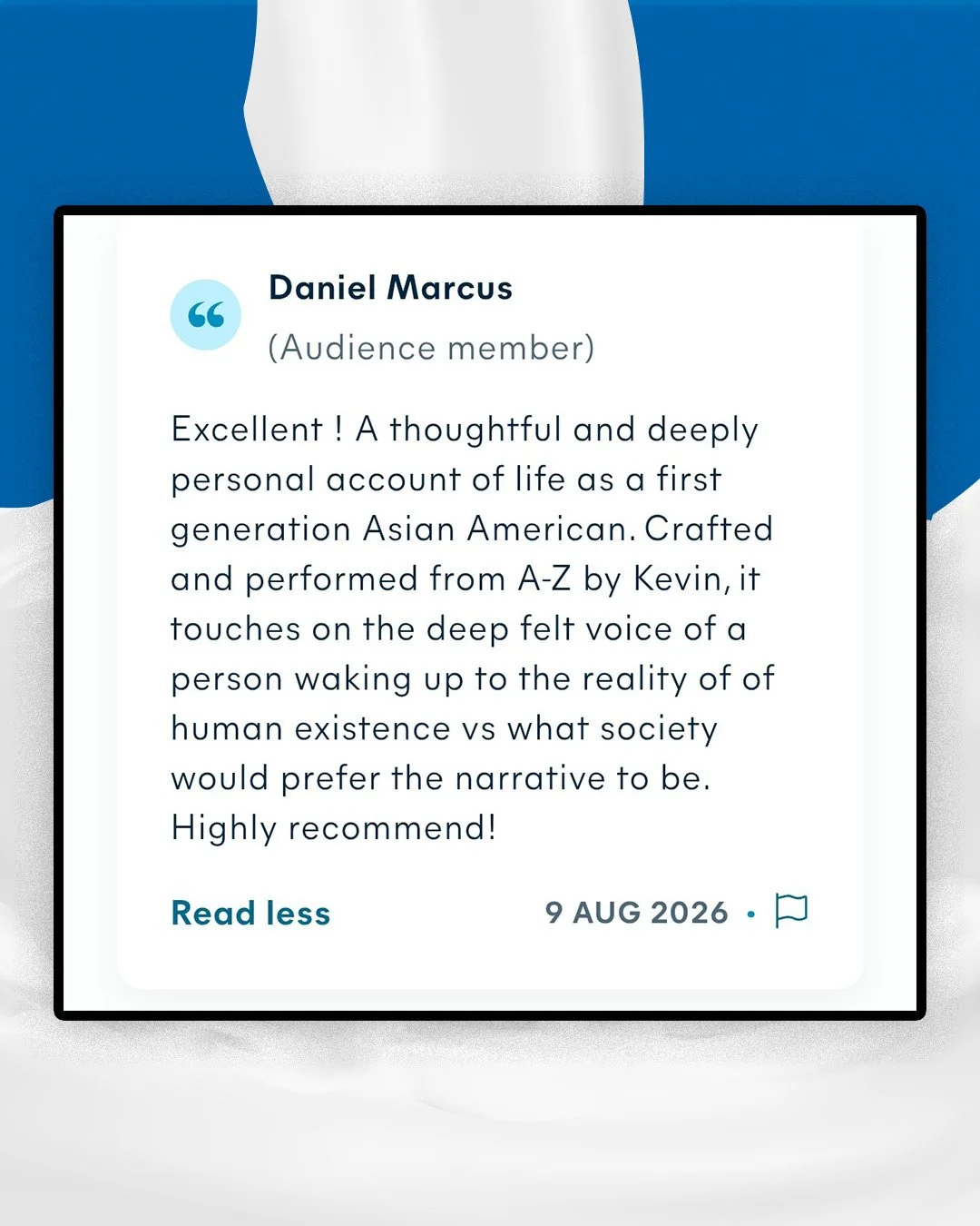
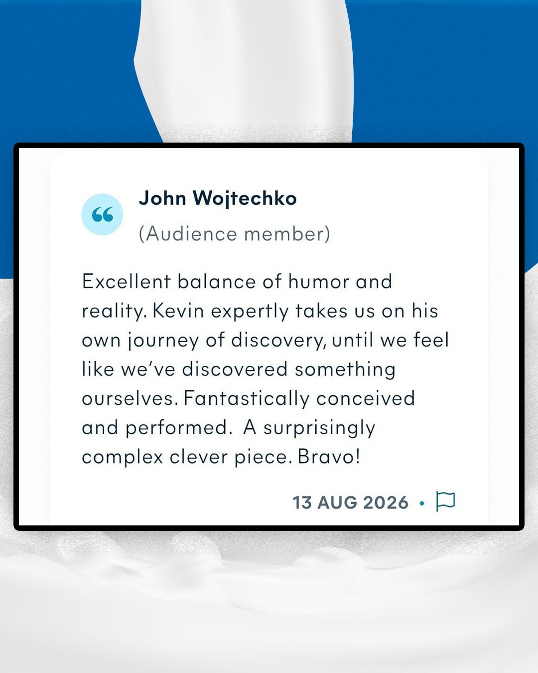
As reviews came in, I collected screenshots and placed them on blue milk-splattered backgrounds to repost and express our udder gratitude.
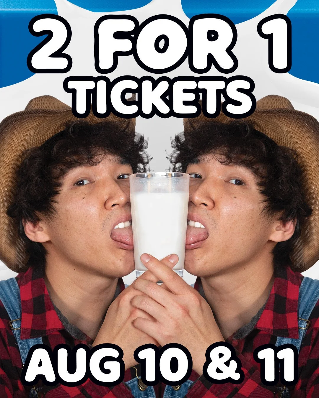
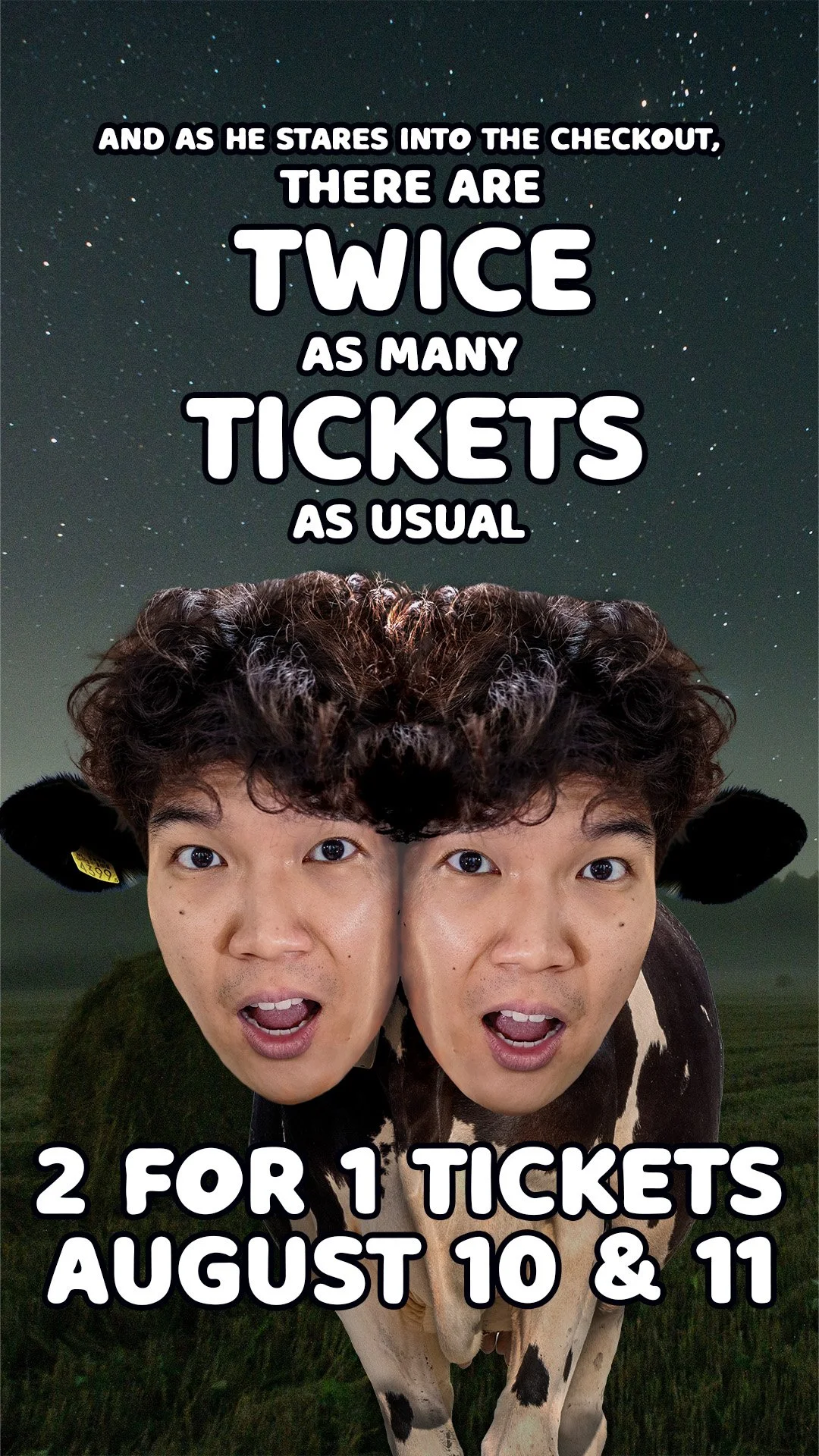
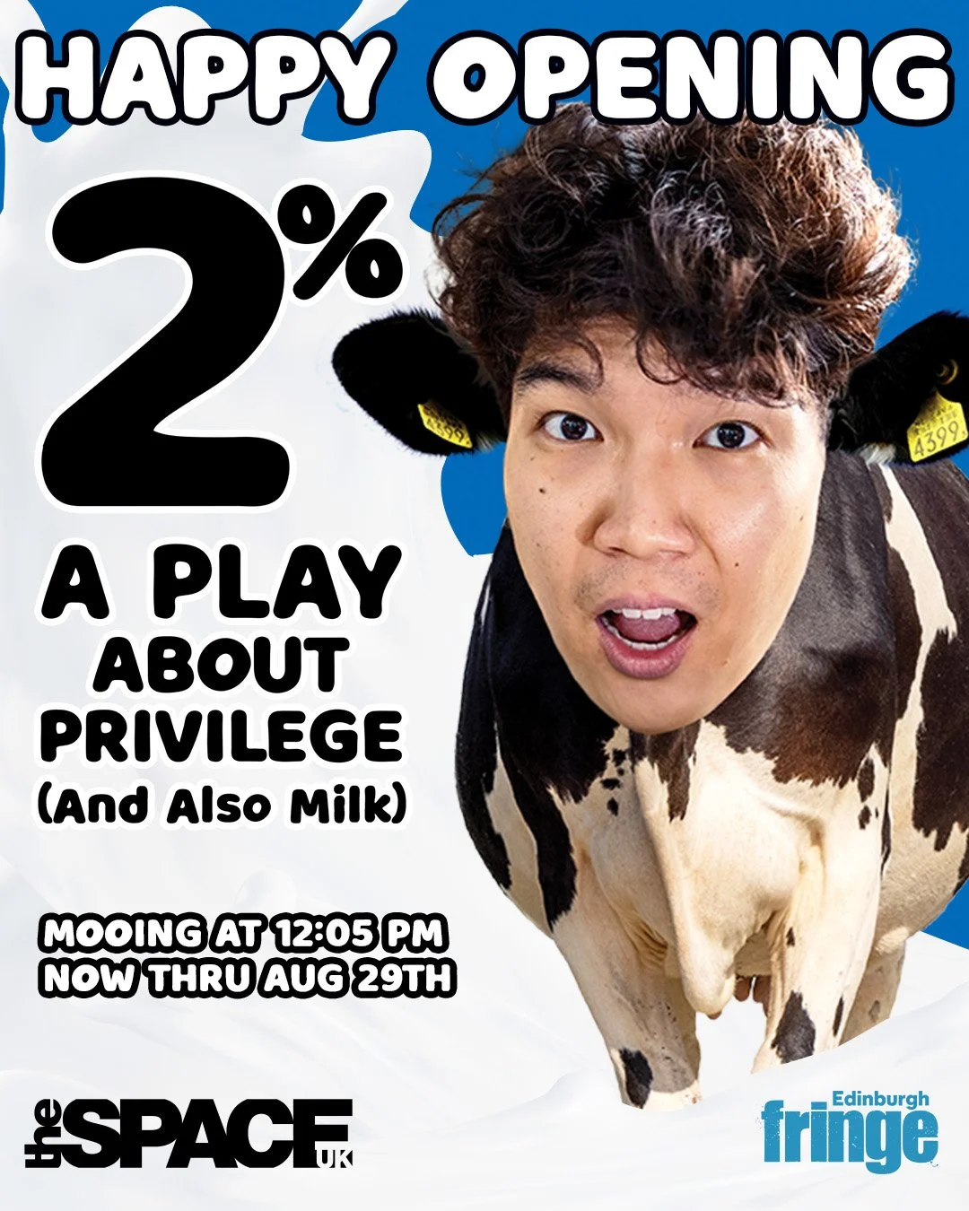
Our “2 for 1” ticket promotion got the double-treatment: two Spicy Farmer Kevins sharing one glass of milk on the Instagram feed, paired with a nod to the viral “Two-Headed Calf” poem in Stories. Additional promotional materials were developed as the production continued the run, including a celebratory post for the opening of the show.
Qian and I collaborated on the Instagram post caption copy and use of the platform’s audio and graphic features to enhance the static posts.
Video Content Creation
Because 2% is so deeply rooted in Qian's personal experience, and because his natural charm and humor are central to the show, I saw an opportunity to let audiences hear directly from the person behind the story. During our marketing discussions, we discussed the potential for video content on social media and set aside a day for filming.
I interviewed Kevin about his writing process, the experiences behind 2%, and his decision to bring the show to Edinburgh. I approached the conversation both as a marketer looking for compelling campaign material and as a fellow artist curious about the creative process.
From approximately 20–30 minutes of interview footage, I first created a five-minute edit organized around several key topics. Qian and I then identified individual moments that could stand on their own and developed them into a series of 40–90 second videos for social media—turning one afternoon of filming into multiple opportunities for audiences to meet Kevin and discover the story behind 2%.
I compiled and edited the interview clips in CapCut, incorporating music and sound effects, on-screen text, visual graphics, customized thumbnails, and a closing frame adapted from the campaign poster for the 9:16 format. Qian provided color correction and audio enhancement in Adobe Premiere Pro, and we collaborated on Reel captions and Instagram's audio and closed-captioning features for the final posts.
⟡ The Interview Series
Photography & Video Capture
As the campaign expanded, we needed additional imagery that could push the visual identity beyond the original smiling-milk portrait. I directed and photographed a shoot with Qian in his Farmer character, experimenting with poses and compositions designed specifically for potential campaign applications.
I selected the strongest images from the session for use in my design concepts, including the Farmer Kevin image ultimately chosen for the venue's 12-sheet/window vinyl and brochure advertisement. Qian completed the final Lightroom refinements before I incorporated the photography into the finished campaign designs.
To give audiences additional access to the production story and provide the creative team with archival material, I captured photography and video during the final dress rehearsals in New York before 2% moved to Scotland.
I compiled footage from the first invited dress rehearsal into a high-energy montage, pairing dynamic moments from the show with key lines cutting through the music to create something between a behind-the-scenes look and a theatrical trailer.
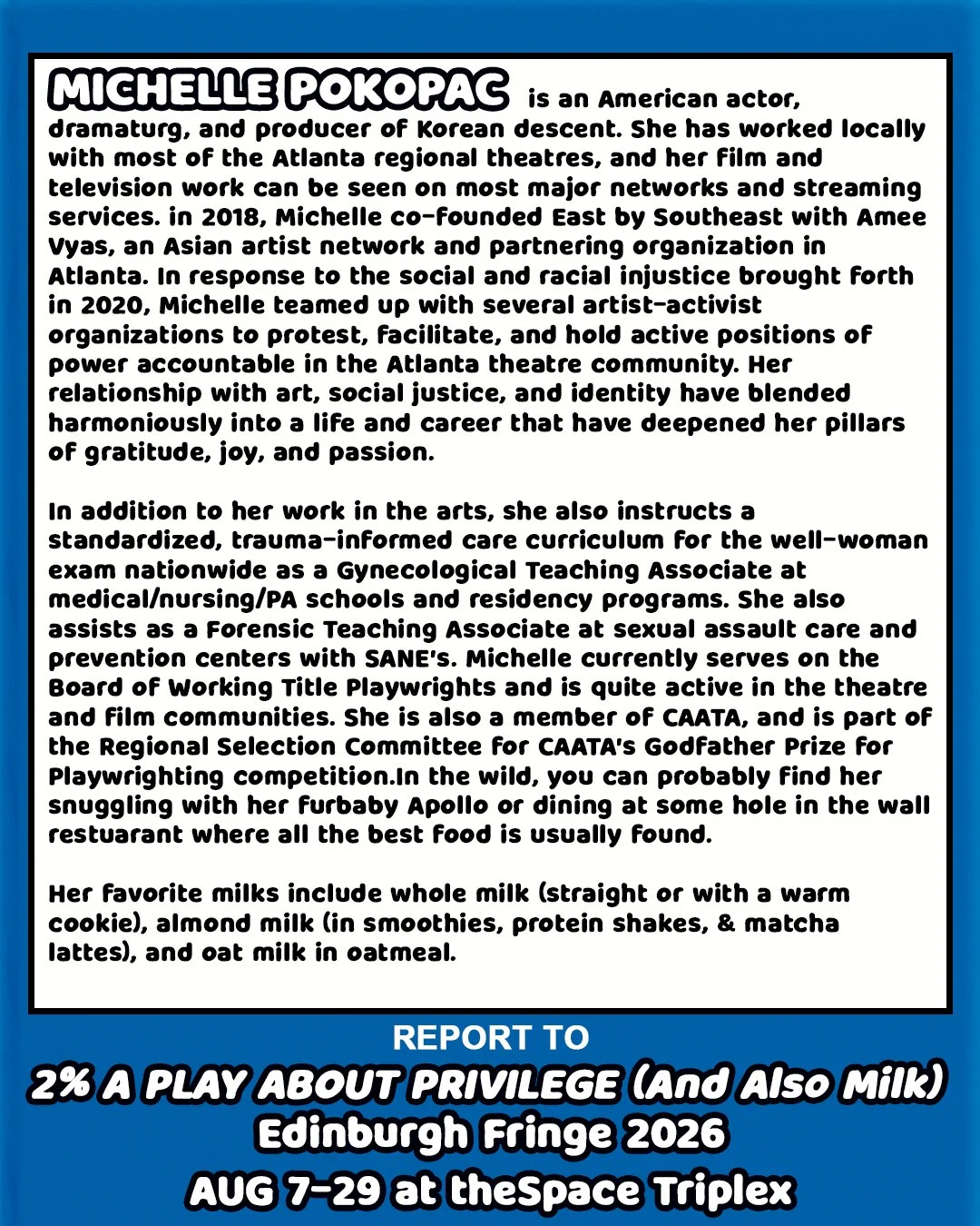
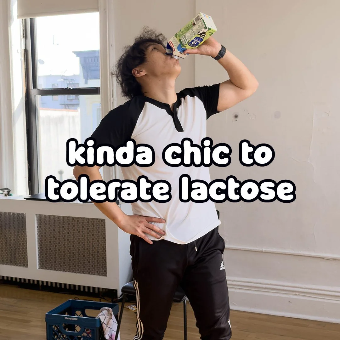
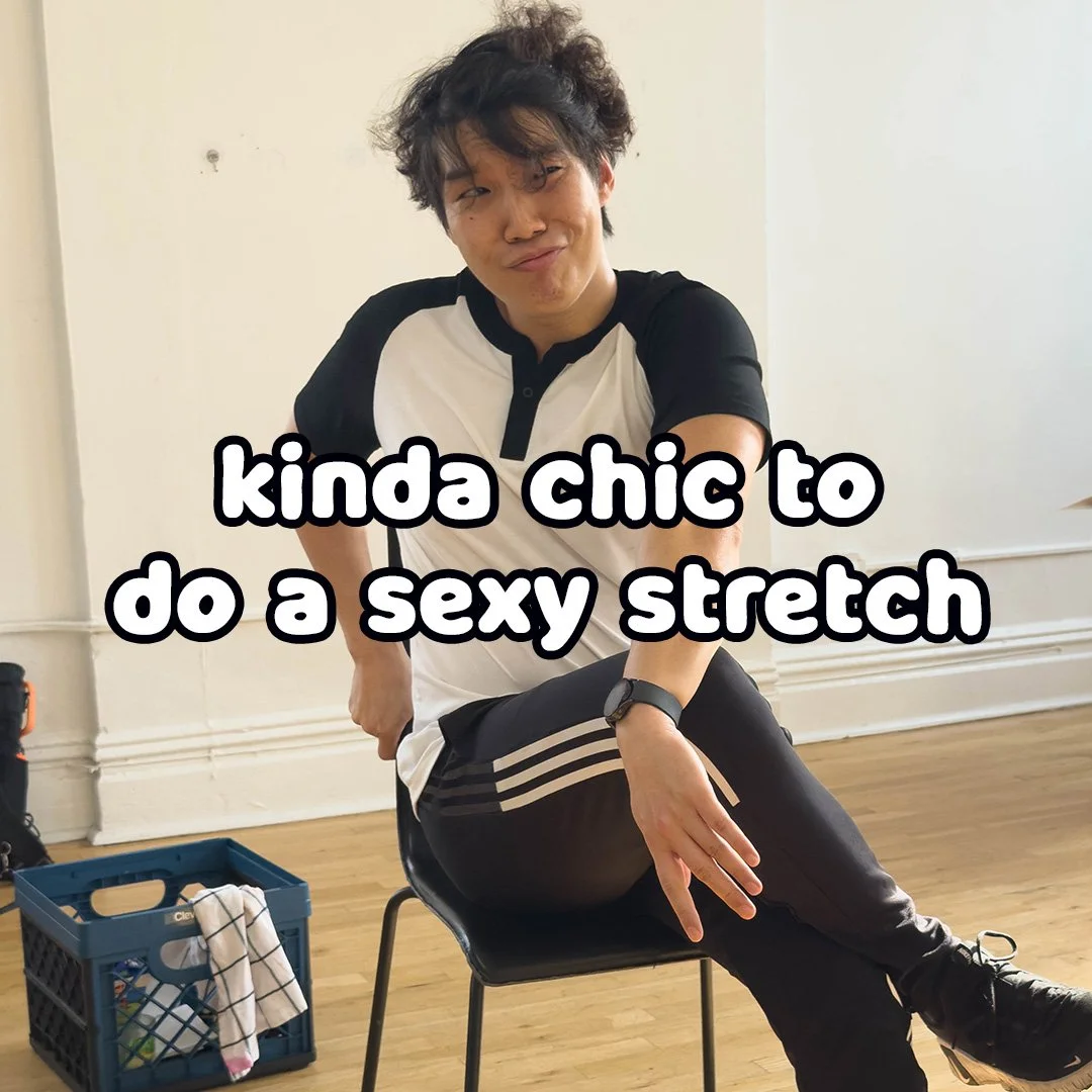
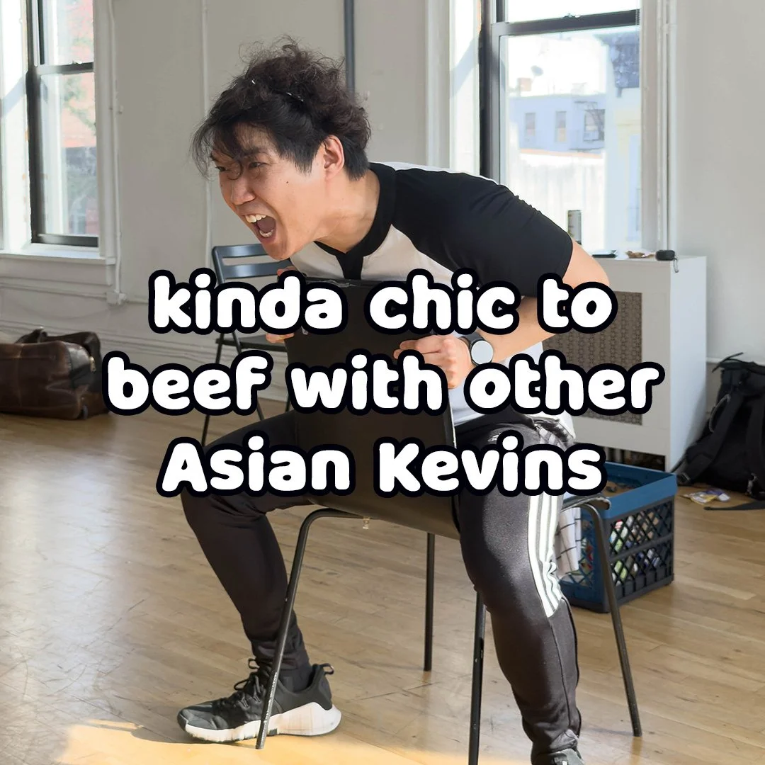
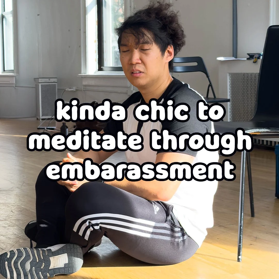
Behind-the-scenes images of the production team were incorporated into the Interview Series, providing visual context as Qian discussed his collaboration with director Michelle Pokopac. Action shots from the final rehearsal also gave us additional material for timely social content, including an adaptation of the “Kinda Chic” meme using themes and references from the show.
Social Strategy
⟡ On the Ground - Building Fringe Connections
The community-driven nature of Edinburgh Fringe presented opportunities to extend 2%’s reach through collaboration with fellow artists and local businesses.
Cross-promotion—whether shouting out another show during a curtain speech, exchanging flyers, or recommending productions to audiences—is common at Fringe, where word of mouth can connect artists with theatergoers already interested in similar work. I researched other productions appearing at the festival, focusing particularly on work created by and starring Asian artists and shows with themes, topics, or tones that overlapped with 2%. From that research, I provided the production team with a targeted list of shows presenting strong opportunities for reciprocal promotion.
I also looked beyond the festival itself for potential community partnerships. Using the show venue as a geographic starting point, I researched nearby Asian-owned restaurants and businesses, bubble tea shops, independent cafés, and other locations serving milk-based products.
The targets were intentional: Asian-owned businesses offered a connection to the cultural identity represented by Qian and the production; cafés and bubble tea shops aligned with the young-adult and arts-oriented audiences attending Fringe; and milk-based businesses offered a playful connection to the show's central metaphor. The venue happened to be located near a particularly strong concentration of Asian restaurants and businesses, so I compiled a list for the production team to approach about displaying flyers and posters once they arrived in Edinburgh.
⟡ Online - Moo-ving to Digital Pastures
With print materials complete and headed to production, I encouraged Qian to expand 2%’s marketing beyond traditional Fringe promotion and build a more intentional digital presence around the show. Drawing on the story, audience, and visual identity we had already developed, I researched platform strategy, content mix, posting behavior, and opportunities for audience discovery, then presented Qian with recommendations for extending the campaign online.
Audience & Objectives
Increase awareness of 2% among Fringe audiences, support ticket sales during the run, and begin building an audience that could follow the show's future development.
Platform Strategy
I recommended prioritizing Instagram and TikTok, with a mix of Reels/video, Stories, branded graphics, and behind-the-scenes content. I also researched optimal posting windows for Edinburgh audiences so content created from New York could be scheduled around UK engagement rather than our local time.
Content Mix
Using a 70/20/10 framework, I proposed balancing:
70% Educational / Entertaining — interviews, humor, trends
20% Industry / Behind-the-Scenes — rehearsals and process
10% Promotional — ticket offers, reminders and direct calls to action
Campaign Timeline
Early content focused on introducing the show, team, and story. As Fringe approached and the run began, the balance shifted toward entertainment, timely promotional content, reviews, behind-the-scenes material, and performance footage.
In Practice
Because of time and production constraints, Qian and I ultimately concentrated our efforts on Instagram, collaborating on posts and captions, tagging the venue and festival accounts, testing relevant hashtags, and publishing around the Edinburgh posting windows identified in my research.
From Strategy to Results
From the campaign's first Instagram post on June 25 through August 30, one day after the final EdFringe performance, the production's official account, managed collaboratively by Qian and me, generated:
31.3K
Instagram Views
+128
Followers
1,490
Interactions
781
Profile Visits
40
Bio Link Taps
During the height of the Edinburgh Fringe campaign in August, the account generated 23.3K views and added 98 followers. By the end of the campaign, the account had grown 189.2% since July 1.
⟡ Top-Performing Campaign Graphic
The campaign's highest-viewed piece of content showcased my window vinyl design, extending a physical advertising asset into a high-performing piece of digital campaign content. The final version of this image posted to Instagram features post copy by Qian.
3,115 views · 599 viewers
48 likes · 10 comments · 4 reposts · 12 shares · 1 save
36 profile visits
⟡ Top Interview/Storytelling Reel
“Meet Kevin,” part of the interview series I developed and edited from our primary content shoot, became one of the campaign's strongest pieces of storytelling-focused video content. The final version of this video posted to Instagram features video filmed and edited by me with audio captions, music selection, and post copy by Qian.
1,526 views · 1,141 viewers
39 likes · 11 comments · 4 reposts · 8 shares
Some of the campaign's strongest reach also came from its simplest personality-driven content. A Reel of Kevin “mooing” to a Highland cow reached 1,191 viewers, generated 1,675 views, and was shared 16 times. Originally captured spontaneously during an outing rather than as planned campaign content, the clip demonstrated the value of recognizing content opportunities in the moment and balancing polished promotional material with authentic, platform-native personality.
Late-campaign content continued to generate engagement as new developments and opportunities were incorporated into the campaign. The four-star review graphic received 1,495 views and 58 likes, while the campaign's “Kinda Chic” meme received 70 likes, one of the strongest like totals among the content reviewed.
Static posts and Reels both contributed substantially to campaign engagement, generating 639 and 543 interactions respectively and reinforcing the value of a mixed-format content strategy rather than relying on a single content type.
From One Flyer to a Full Campaign
What began as a request for a two-sided Fringe flyer grew into an integrated campaign spanning print, digital design, photography, video, social content, audience outreach, and marketing strategy.
More importantly, each new piece grew from the same foundation: understanding Qian's story, the production's personality, and the audiences we wanted to reach. The milk-carton concept became more than a flyer treatment—it gave us a visual and verbal language flexible enough to move from the streets of Edinburgh to Instagram while still feeling unmistakably like 2%.
For me, the project reinforced that the strongest creative work doesn't stop at making something look good. It creates a system people can recognize, respond to, and build on—and gives a good story more ways to find its audience.
Music & Media Disclosure
Music and sound effects used in the 2% campaign videos featured on this website were sourced under the Pixabay Content License.
Asset Note
Original promotional photography was directed and photographed by Katie Jacoby, with final photo processing by Kevin Qian. Select supplemental imagery was sourced from Pexels and Pixabay under their respective licenses.