
NP Thyroid® Branded Thank You Cards
Designing Within the Brand
Project Type: Corporate & Pharmaceutical Communications
Role: Graphic Designer/Marketing Preceptorship Mentee
Client: NP Thyroid® Product Sales Team / Alora Pharmaceuticals Preceptorship
Deliverables: Seasonal Greeting Card · Evergreen Greeting Card · Print-Ready Production Designs
Corporate Design · Brand Stewardship · Print Production · Regulated Communications
The Project: During an inter-company preceptorship with Alora Pharmaceuticals, the NP Thyroid® product sales team approached me to design two branded thank-you cards for use by sales representatives: one seasonal spring design and one evergreen option suitable for year-round use.
Both designs needed to feel distinct while remaining immediately recognizable as part of the NP Thyroid® brand and accommodating required pharmaceutical disclosures. The finished cards also needed to support the practical needs of sales representatives working in the field, including an integrated way to attach their individual business cards.
Working Within Constraints:
Rather than developing a new visual identity, this project required me to work within an established one. The NP Thyroid® logo, color palette, required disclosures, and pharmaceutical advertising standards created the visual and regulatory framework for both designs.
Within those boundaries, my goal was to create two different emotional directions—one playful and seasonal, one clean and evergreen—without losing brand recognition or functionality.
NP Thyroid® is a registered trademark of Acella Pharmaceuticals, LLC.
NOTE: No product shown on this site is being used as an advertisement for said product nor makes any claim of safety or efficacy. All images included are to be viewed as examples of design work that I created.
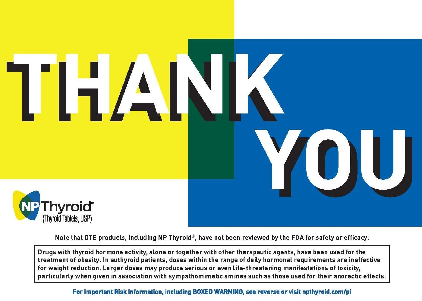
The NP Thyroid® brandmark already suggested a natural starting point for the spring direction. Looking more closely at its butterfly-like form, I noticed that the green shape created where the blue and yellow elements meet could also function as a flower petal.
I deconstructed those existing brand elements into repeating floral patterns and butterfly-inspired forms, creating a seasonal visual language without introducing colors or motifs that felt disconnected from the established identity.
Spring: Finding Flowers in the Brand
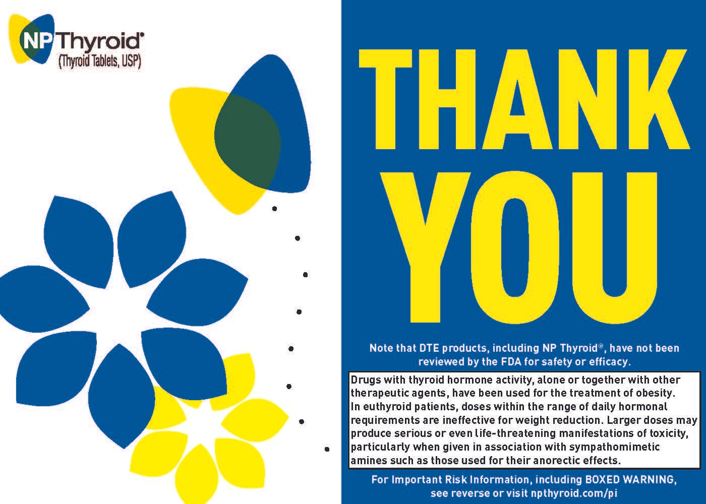
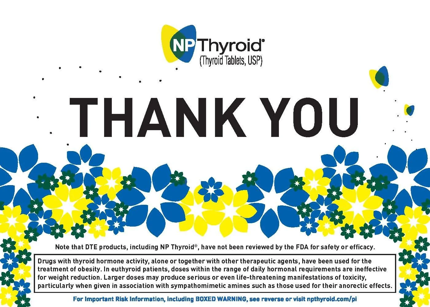
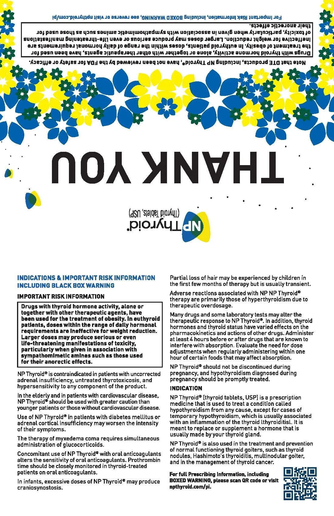
⟡ Final Seasonal Design
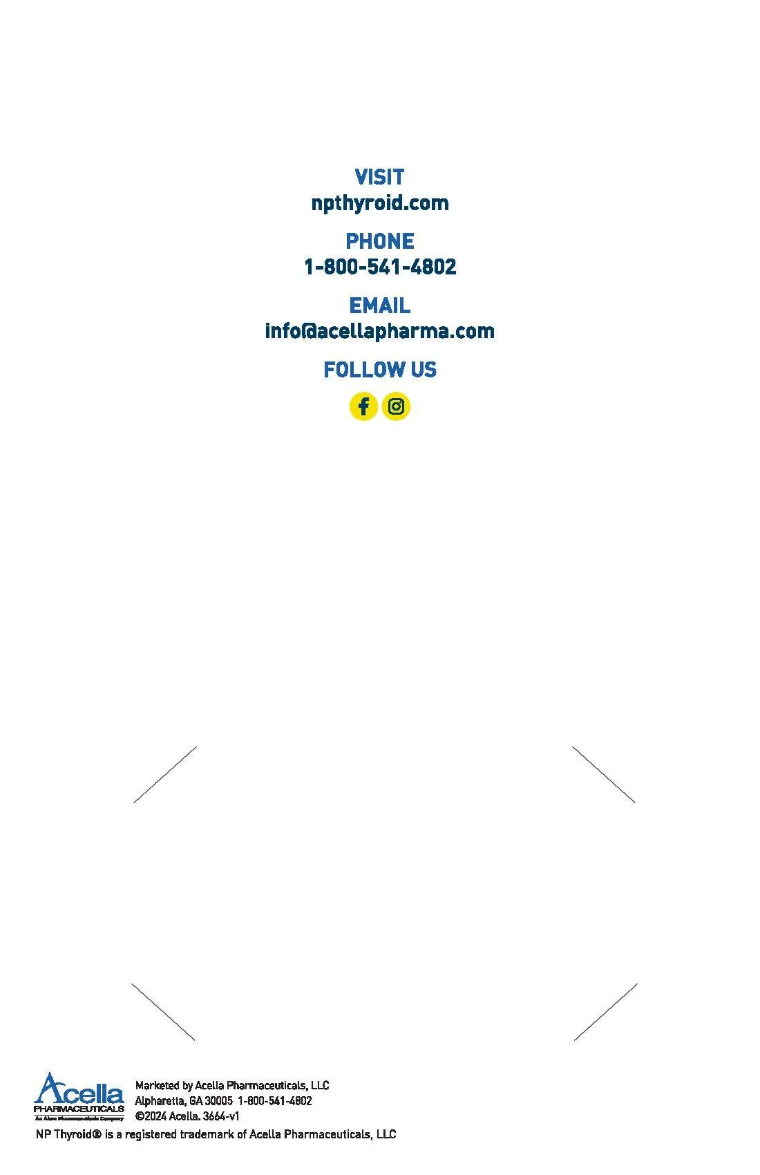
The selected direction balances the spring-inspired pattern with clear brand recognition and space for required information. Inside, the visual system becomes more restrained so contact details, company branding, and the sales representative's business card remain the functional priority.
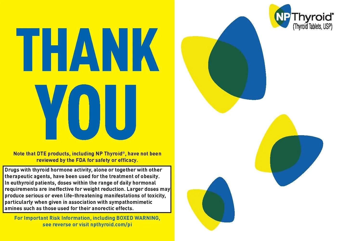
Where the spring direction uses organic shapes and playful movement, the evergreen design takes a more structured approach. Geometric forms built from the brand's blue, yellow, and green palette create a clean, professional composition suitable for year-round use.
Overlapping shapes echo the construction of the NP Thyroid® mark while giving the design its own visual identity, allowing the two cards to feel distinct without feeling unrelated.
Evergreen Direction: Year-Round Recognition
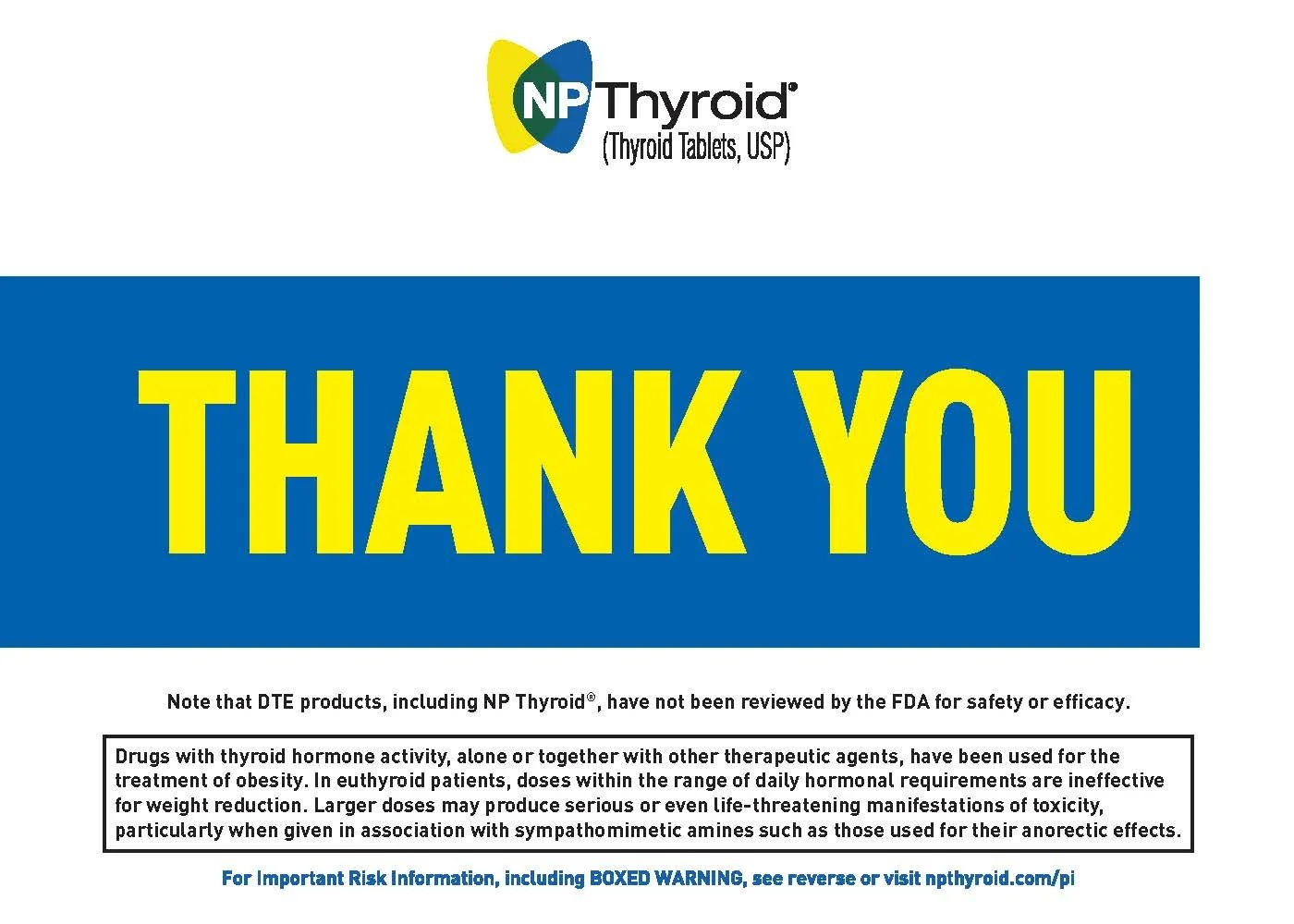
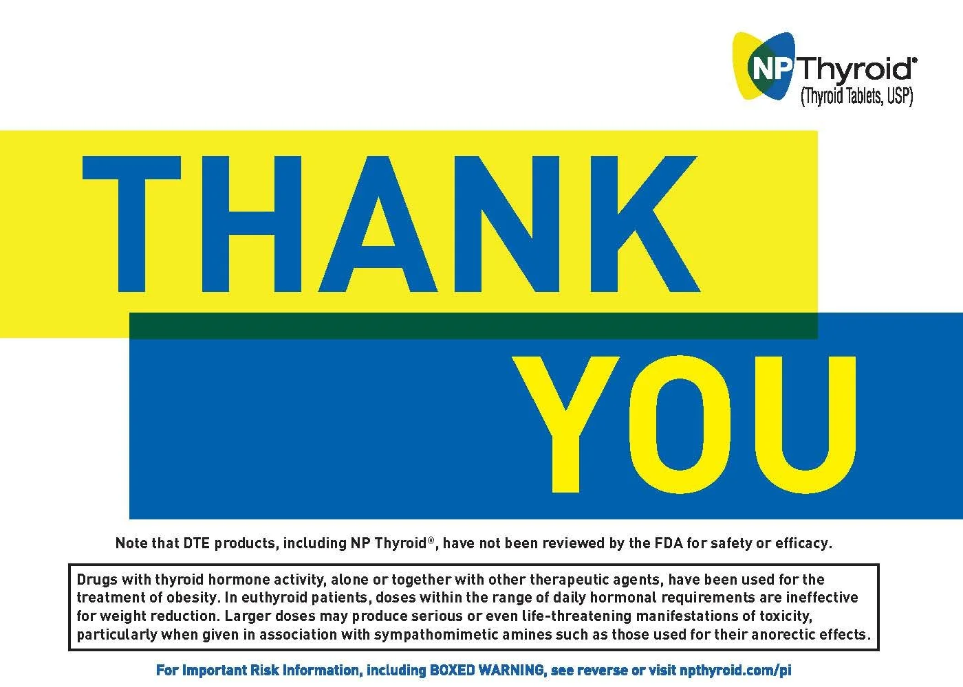
⟡ Final Evergreen Design
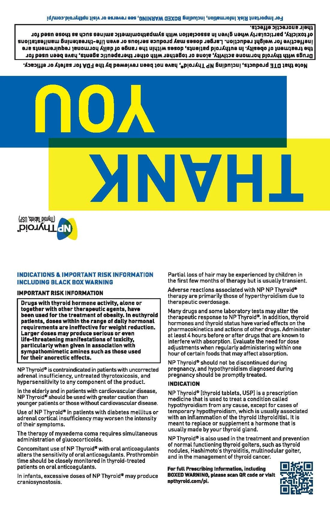

Designed for the Sales Team
The interior of both cards incorporates a four-corner die cut that allows sales representatives on the road to securely insert their individual business cards without tape, adhesive, or additional materials.
It was a small production detail with a practical purpose: simplifying preparation for representatives working in the field while keeping their contact information integrated cleanly into the finished piece.
The two final cards demonstrate different expressions of the same established identity: one seasonal and playful, the other structured and evergreen. Working within existing brand and regulatory requirements challenged me to find creative flexibility inside defined boundaries while keeping the finished pieces practical for the sales team using them.
The project reinforced that brand consistency doesn't require every communication to look identical—it requires each one to feel recognizably part of the same system.