
11th Annual Office Chili Cook-off
Serving Up a Branded Experience
Project Type: Internal Event Marketing & Communications
Role: Graphic Designer
Client: Previous Employer’s Employee Engagement Committee
Deliverables: Event Identity · Promotional Poster · Digital Signage · Sign-Up Materials · Voting Ballots · Entry Labels · Award Certificates
Tools: Adobe Illustrator · Adobe PowerPoint
The Project: The annual Super Bowl Chili Cook-Off was already an established office tradition. For its 11th year, I worked with the company’s employee engagement committee to create a playful visual identity and suite of promotional and event materials designed to build excitement, encourage participation, and carry a consistent experience from the first event announcement through the crowning of the Chili Champion.
Drawing inspiration from the visual language of the Super Bowl, I developed a custom event logo and illustrated chili pepper and bean mascots, then extended the identity across print, digital signage, participant materials, voting, and awards.
The Goals:
Build awareness and excitement around the annual employee event.
Encourage participation, both from chili competitors and employees attending/voting.
Create a recognizable event identity that felt playful, competitive, and connected to the Super Bowl theme.
Maintain visual consistency across promotional and functional materials used before, during, and after the event.
The Challenges:
Create a distinctive event identity that combined the visual excitement and competitive spirit of the Super Bowl with the playful personality of an office Chili Cook-Off.
Design for in-house production: All printed materials needed to reproduce reliably on standard office printers, requiring the visual system to work within everyday paper sizes and production limitations rather than professional printing capabilities.
Make implementation easy: Event materials needed to be straightforward for colleagues without professional design software or design experience to print, distribute, display, and use.
Balance personality with function: Promotional materials could prioritize energy and humor, while ballots, entry labels, sign-up sheets, and certificates needed to remain clear, practical, and easy to use.
Navigate stakeholder feedback: Develop designs in coordination with the employee engagement committee while incorporating site-leadership feedback, organizational expectations, and the practical needs of the event.
Cooking Up an Identity
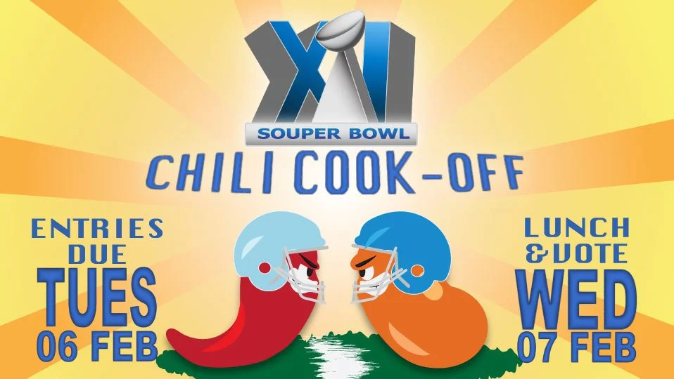
With the event scheduled around Super Bowl weekend, I used the visual language of professional football as the starting point for a custom Chili Cook-Off identity. In Adobe Illustrator, I experimented with 3D typography and dimensional effects to create an event mark that evokes the spectacle of the Super Bowl while establishing the Chili Cook-Off as its own playful competition.
I paired the logo with two original mascots—a chili pepper and bean facing off in football helmets. Their opposing poses introduce the competitive spirit of the cook-off, while colors drawn from the company’s existing identity help connect the playful event branding back to the workplace hosting it.
⟡ Promoting the Event
The “Souper Bowl” logo and mascots became the focal point of the promotional poster, supported by a bright orange-and-yellow sunburst that brings energy to the composition and draws the eye toward key submission and voting dates. Because all materials would be produced in-house, the poster was designed specifically for reliable printing on standard letter-size office paper.
To build awareness in the weeks leading up to the event, I adapted the identity across both print and digital office environments. Promotional posters placed in shared spaces reached employees throughout the workday, while a companion PowerPoint slide for lobby television displays extended the campaign to another high-traffic touchpoint.
Rather than simply resizing the poster, I reworked the composition for the horizontal screen format while preserving the logo, mascots, sunburst background, color palette, and event information—keeping the campaign immediately recognizable across both applications.
Promotion to Participation
Once employees arrived at the event, the visual identity shifted from promotion to function. I extended the same logo, palette, sunburst treatment, and illustration style across the materials participants would interact with throughout the Chili Cook-Off.
While the promotional pieces could prioritize energy and visual impact, the materials used during the event needed to prioritize clarity. I simplified the visual system for ballots, labels, and sign-up materials, using the event branding primarily as a frame around clearly structured fields and information.
This allowed the functional pieces to remain unmistakably part of the Chili Cook-Off without letting decoration interfere with usability.
⟡ Toppings Sign-Up Sheet
Placed in the office’s two breakrooms ahead of the event, the toppings sign-up sheet extended the event identity into another high-traffic employee touchpoint. The “Souper Bowl” logo, sunburst, and company colors helped distinguish it from everyday office notices while clearly organizing names and contributions. Offering employees the opportunity to contribute toppings and other items also created another pathway for participation without requiring them to enter a pot of chili.
⟡ Entry Labels
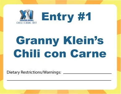
Entry labels balanced personality with function, identifying each competing chili by its contestant-created name while providing dedicated space for dietary and allergen information.
⟡ Voting Ballots
Voting ballots gave attendees a simple, clearly structured way to participate in selecting the Chili Champion. The event branding frames the functional voting area without competing with it, maintaining the competitive theme while keeping the voting process straightforward and easy to use.
⟡ Award Certificates
Award certificates carried the event identity through its final moment: recognizing the winners. Signed by the site manager and presented to the participants receiving the most votes, they gave the Chili Cook-Off a branded conclusion while celebrating employee participation.
Final Spoonfuls
What began as promotional artwork became a small visual system supporting the Chili Cook-Off from announcement through awards. The project reinforced how even an informal internal event benefits from thoughtful, consistent design not only to make it look polished, but to help people understand how to participate and make the experience feel special.
The work also received positive feedback from employees, both for the Chili Cook-Off and for additional engagement events I supported later that year. One senior member of the company specifically noted that my design contributions elevated the appearance of internal communications and reflected positively on the company’s workplace culture.
By balancing playful event branding with functional communications, I turned a familiar office tradition into a cohesive experience employees could recognize, interact with, and enjoy from beginning to end.
Unlike academic projects built around a predefined rubric, this work gave me the opportunity to see my designs function in a real environment—with real production limitations, stakeholder feedback, and coworkers actually using the materials I created. It reinforced something that continues to shape my approach to design: a successful creative solution isn't just visually engaging; it has to work for the people producing it, using it, and experiencing it.