
Marietta Craft Club
Making Community Look Handmade
Project Type: Client Design & Communications
Role: Graphic Designer
Client: Marietta Craft Club
Deliverables: Welcome Poster · Social Media Carousel
Client Design · Social Media · Print Design · Visual Storytelling
The Project: Marietta Craft Club commissioned a welcome poster for its first meeting, asking for a design that reflected the creative, hands-on spirit of a community built around making things together. I developed multiple visual directions before the client selected a concept that used crafting materials themselves—yarn, paper, beads, paint, and other familiar supplies—to construct the design's typography and imagery.
The selected direction was later extended into a social media carousel, adapting the handmade visual language from a physical welcome piece into a digital format designed to introduce the club and encourage connection online.
Crafting the Concept
Because the club brings together people across different creative disciplines, I wanted the visual identity to feel broader than any single craft. My initial concept focused on communicating the club's themes of community and multidisciplinary creativity, using multiple hands and crafting mediums to visually “create” the Marietta Craft Club logo.
A Handmade Welcome
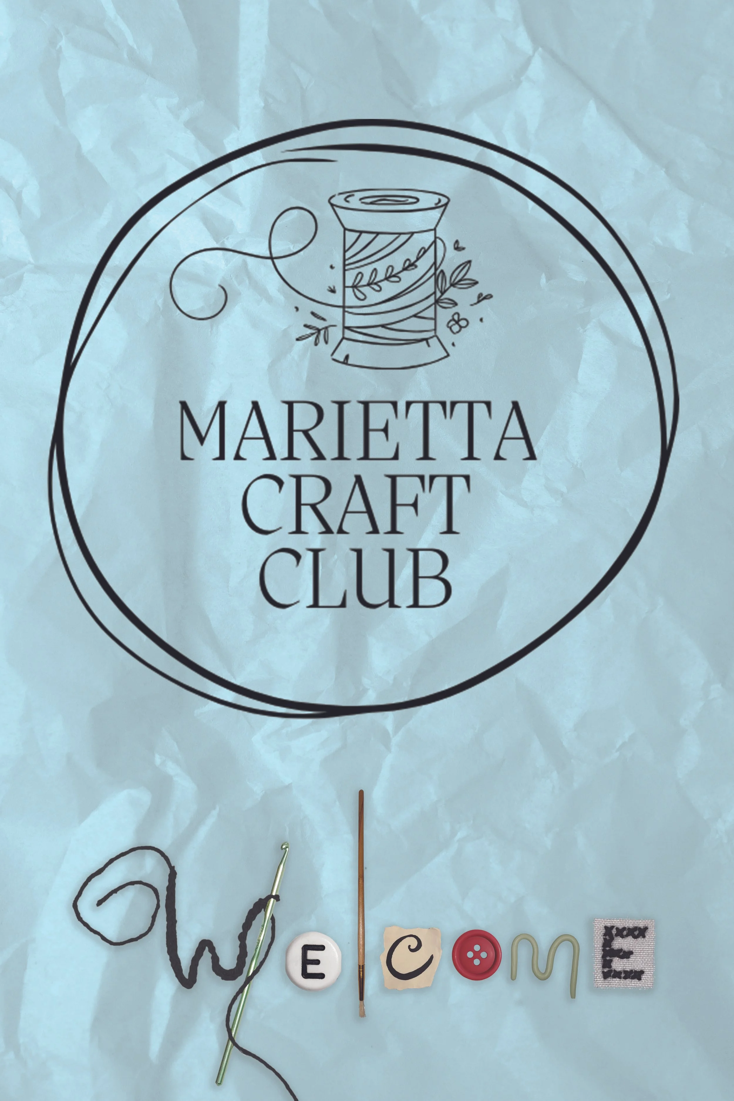
The second proposed poster design, ultimately selected by the client for the final design, took a different mixed-media-inspired approach using recognizable craft materials as design elements, creating a visual language that feels playful, tactile, and intentionally handmade.
Digging through my own stash of craft materials, I noticed familiar shapes of the alphabet and captured photographs of these items. Rather than simply illustrating craft supplies around the message, I used the materials themselves as typography to build the visual language of the poster. Different textures and techniques give each element its own personality while the shared handmade treatment keeps the composition cohesive.
The crumpled paper texture nods to the messy, imperfect nature of crafting, while the intentionally playful arrangement reflects the spontaneity of a craft table. Careful attention to scale, spacing, and hierarchy keeps the welcome message immediately legible, balancing handmade personality with enough structure to function as event signage.
Using multiple types of craft materials also helped reinforce the club's inclusive identity: there isn't one prescribed way to be creative, and all practices are welcome here. The visual variety reflects a community where different interests, skills, and styles can exist together.
From Welcome to Connection
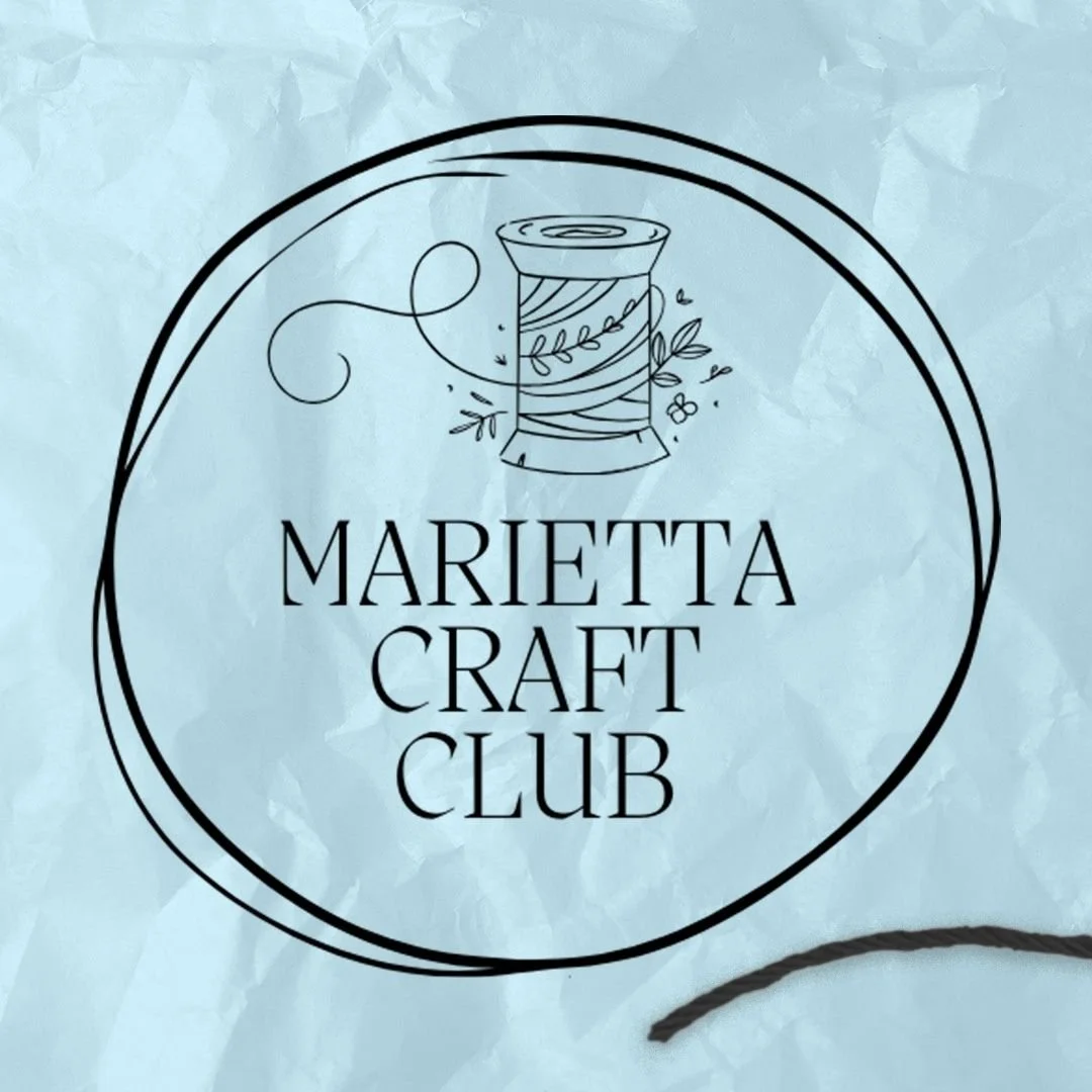
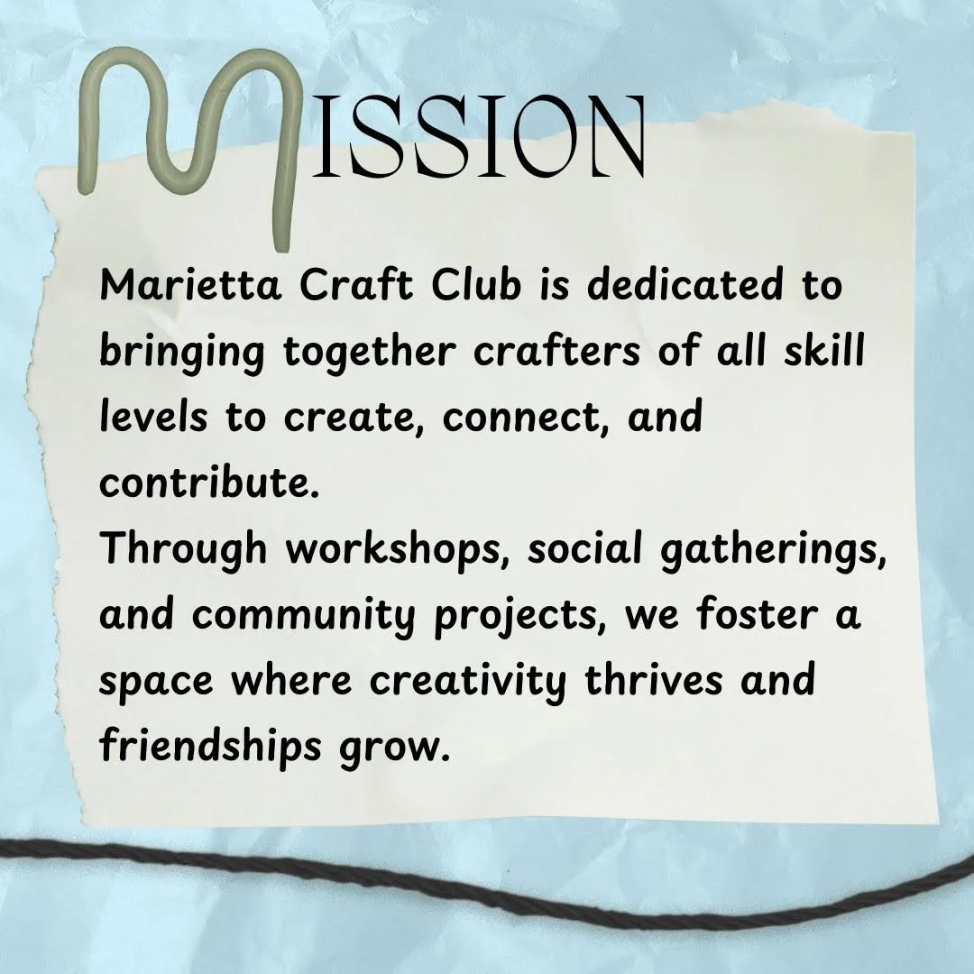
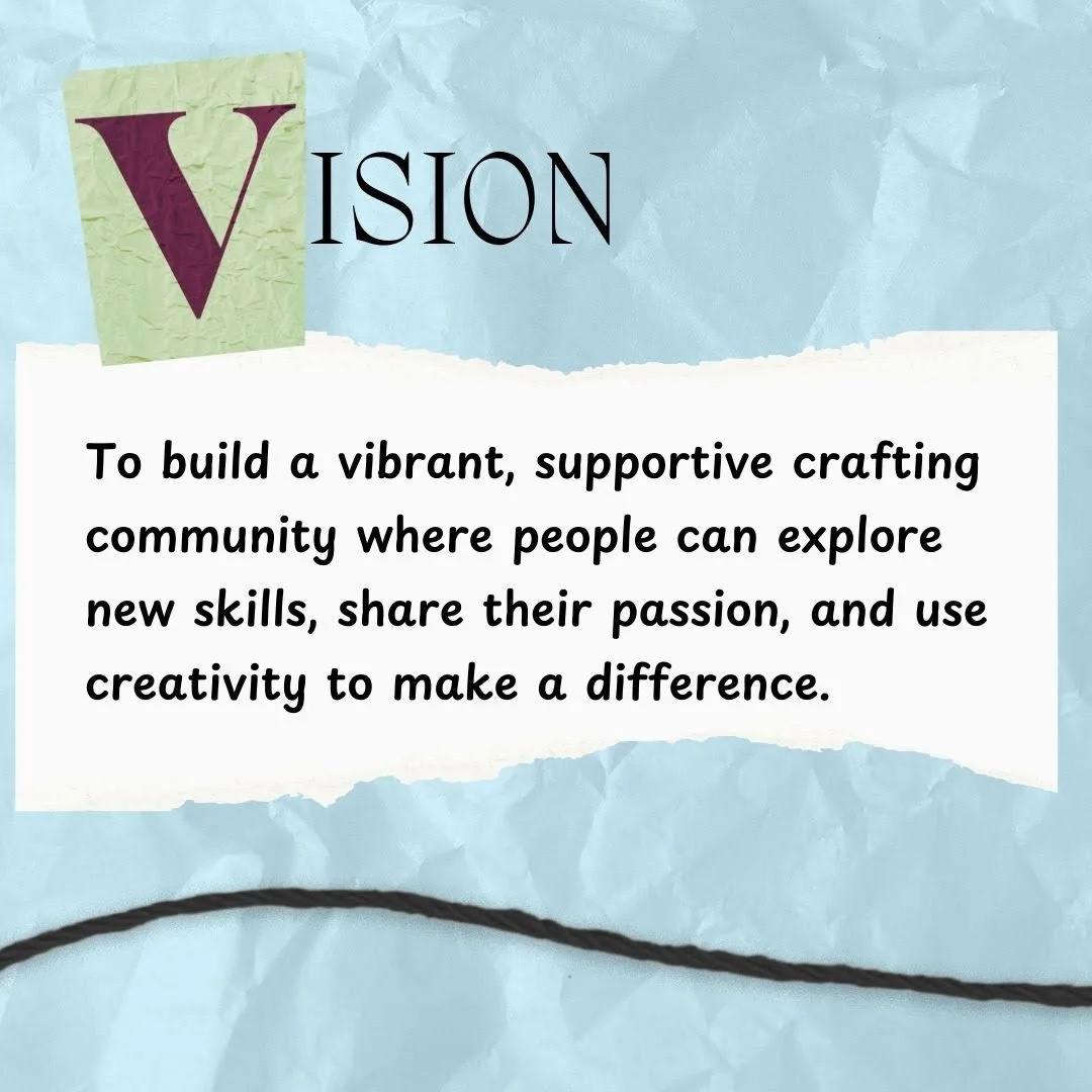
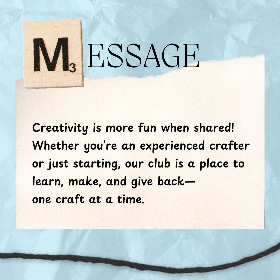
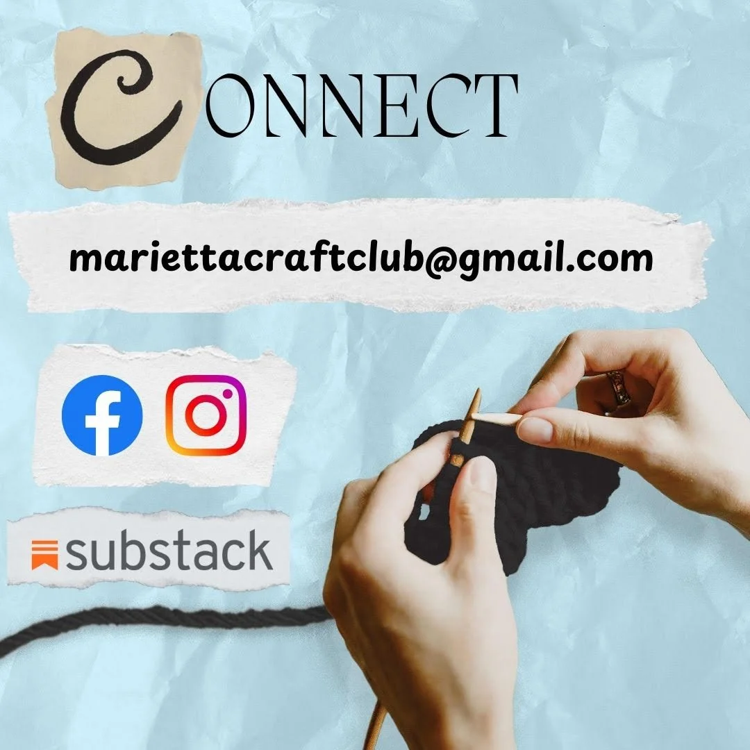
After the welcome poster established the project's visual direction, I adapted the concept into a social media carousel designed to introduce the club in a more conversational format. Rather than simply shrinking the poster for Instagram, I extended its visual system across multiple slides, using the same handmade materials, typography, and playful composition to create continuity from one frame to the next.
A continuous strand of yarn helps visually connect the carousel, guiding the viewer through individual slides while reinforcing the tactile, handmade quality of the original concept. Each frame can communicate independently while still feeling like part of the same visual story.
Made to Connect
Marietta Craft Club was a small project with a simple objective: make a new creative community feel welcoming from its very first interaction. By building the visual language from the materials its members use themselves, I created a design system that feels less like branding placed around a crafting community and more like something made by one.
Asset Note
Original craft-material photography was photographed and modified by Katie Jacoby. Select supplemental imagery was sourced from Pexels and Canva under their respective licenses.