
RacerX
Building a Brand for Play
Project Type: Academic Brand Identity Concept
Role: Brand & Graphic Designer
Client: RacerX / GRA260: Designing a Brand Identity, Southern New Hampshire University
Deliverables: Logo Design · Logo Variations · Color Palette · Typography · Brand Guidelines
Brand Identity · Logo Design · Visual Systems · Brand Guidelines
The Project: RacerX is a fictional video game development company created as the client for my capstone project in GRA260: Designing a Brand Identity. The brief called for the development of a complete visual identity capable of introducing a new gaming company to a target audience of Millennial gamers.
Beginning with audience and industry research, I developed the identity from initial logo concepts through a final brand system, including logo variations, typography, color standards, usage rules, and guidelines designed to keep the brand recognizable across future applications.
Finding the Mark
The RacerX name immediately suggested speed, competition, and motorsport, while the company's industry required the identity to remain clearly connected to gaming. My early strategy focused on finding visual territory where those two worlds could intersect without relying too heavily on the familiar clichés of either category.
The target audience of Millennial gamers also informed the direction toward a bold, contemporary identity with enough personality to feel playful without becoming juvenile.
Early sketches explored ways to combine the speed and movement associated with racing with recognizable elements of gaming. From those explorations, I developed three distinct logo directions for further consideration.
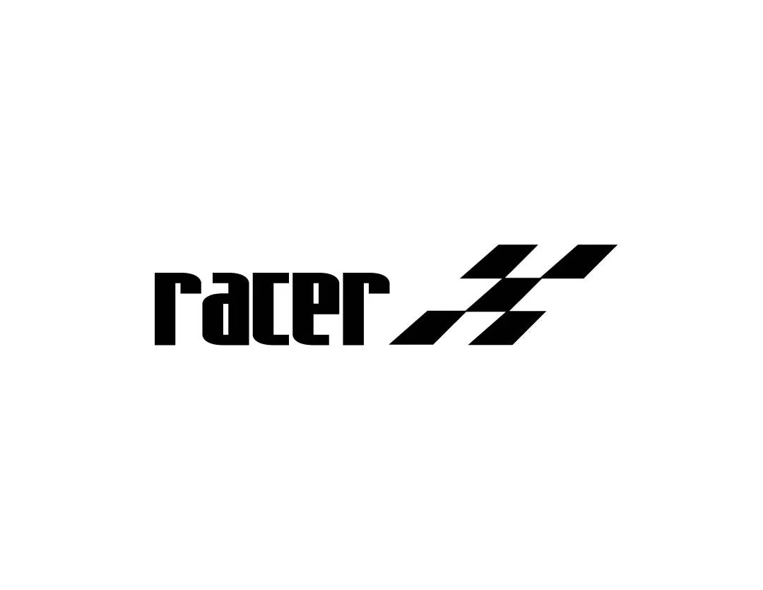
Direction 1 — Checkered X
Racing / speed / typographic integration
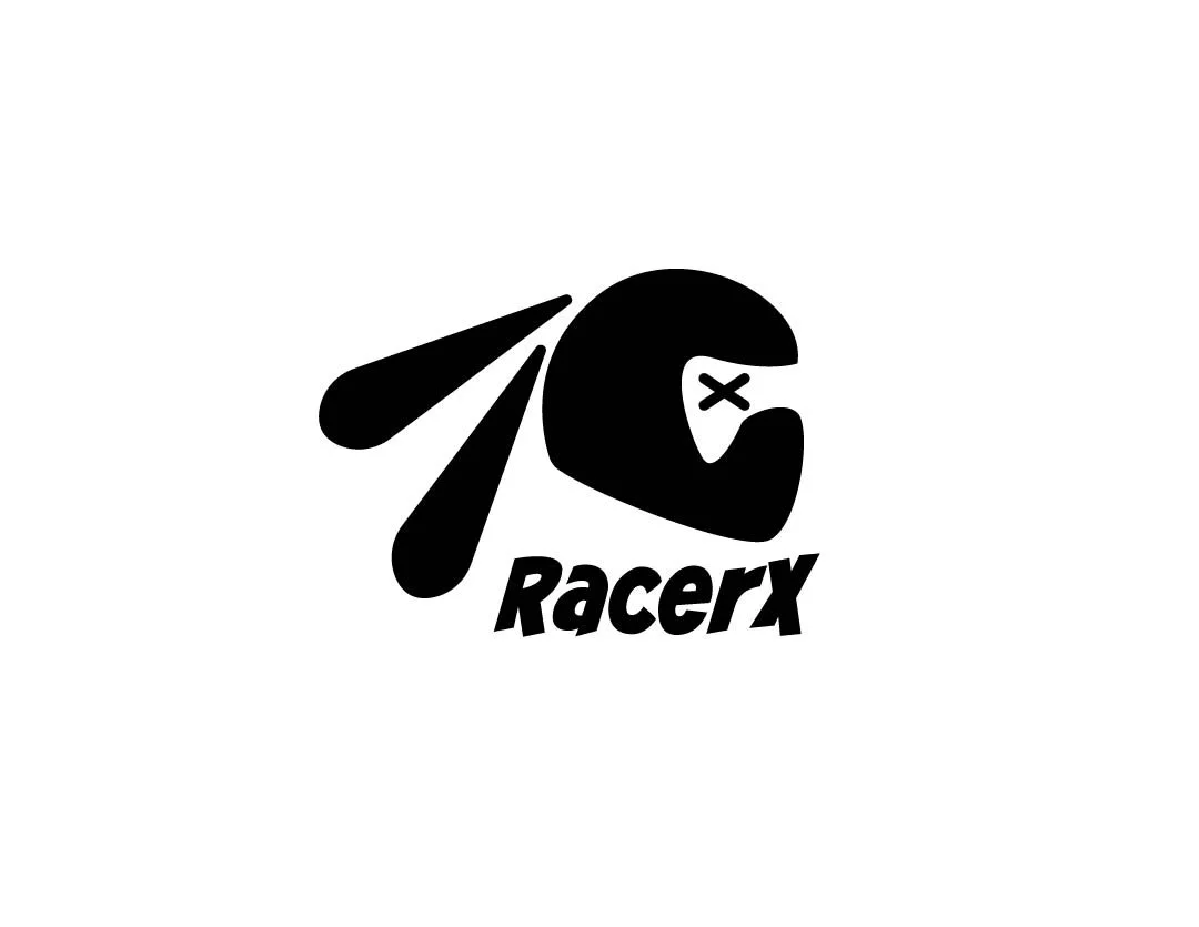
Direction 2 — Racer Rabbit
Character / helmet / game-controller integration
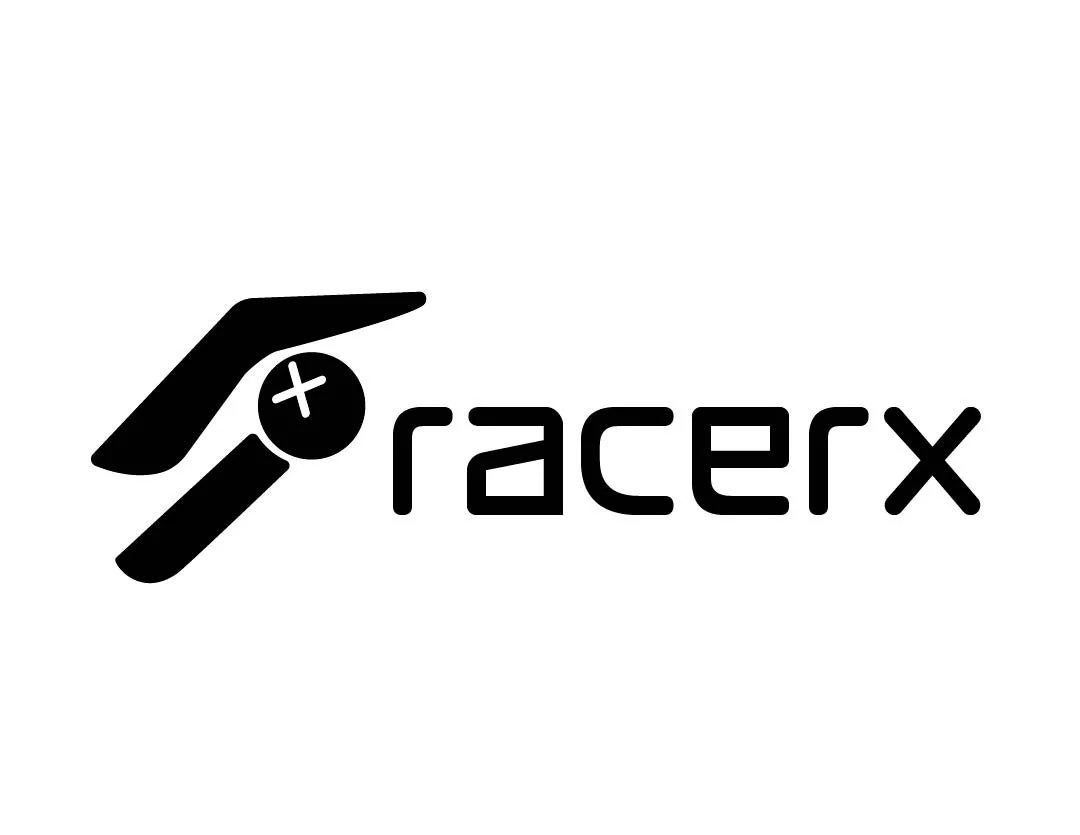
Direction 3 — Joystick
Gaming / movement / forward momentum
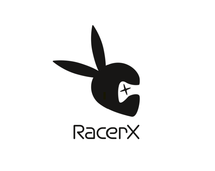
The selected direction combined several pieces of the brand story into a single character mark: a racing helmet establishes speed and competition, while the controller-inspired visor connects the character directly to gaming. The rabbit motif adds personality while reinforcing ideas of quickness and movement.
During refinement, I simplified the original illustration into a cleaner, more scalable mark, sharpening the silhouette and reducing unnecessary detail. A lightweight sans serif wordmark balances the stronger character icon and keeps the overall identity contemporary and legible.
Initial Selected Concept
Selected Concept Version 2
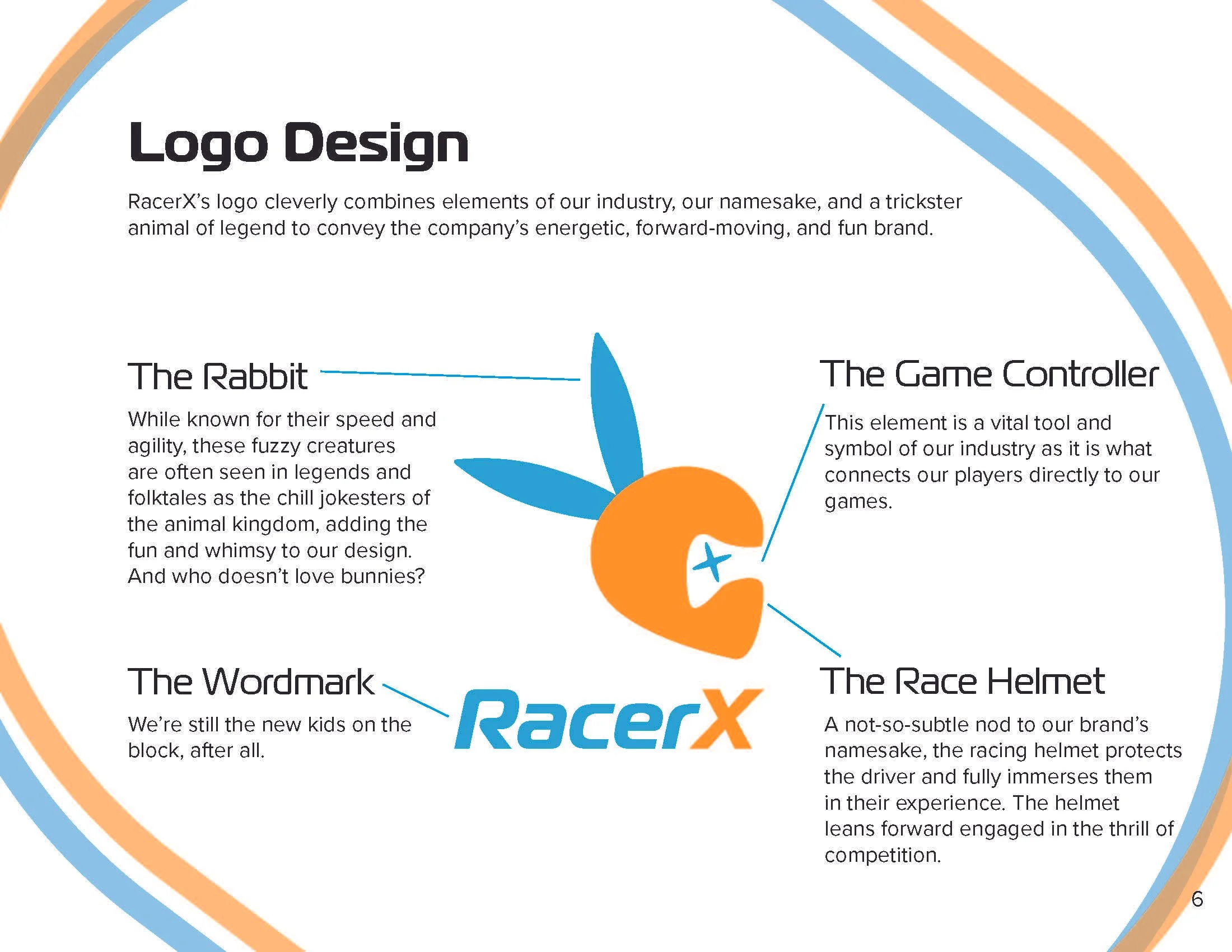
⟡ Final Logo Design
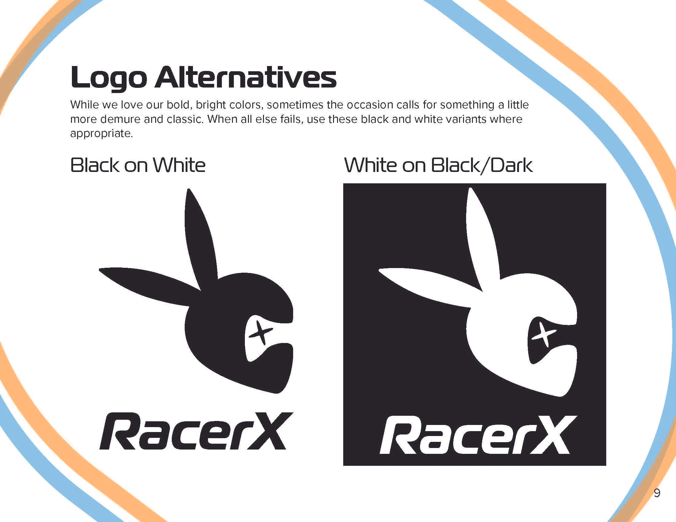
The final logo integrated two brand colors per rubric requirements balancing the improved rabbit image with a bolder font for the wordmark. The font retains the whimsy of the initial iteration while also carrying the clear and clean lines of the second concept.
From Logo to System
A logo alone doesn't create a consistent brand. The final phase of the project translated the selected RacerX identity into a practical set of visual standards governing how the brand should appear across future applications.
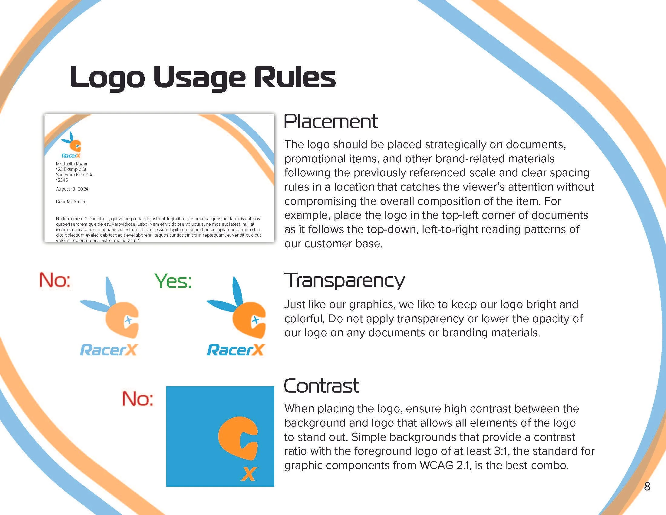
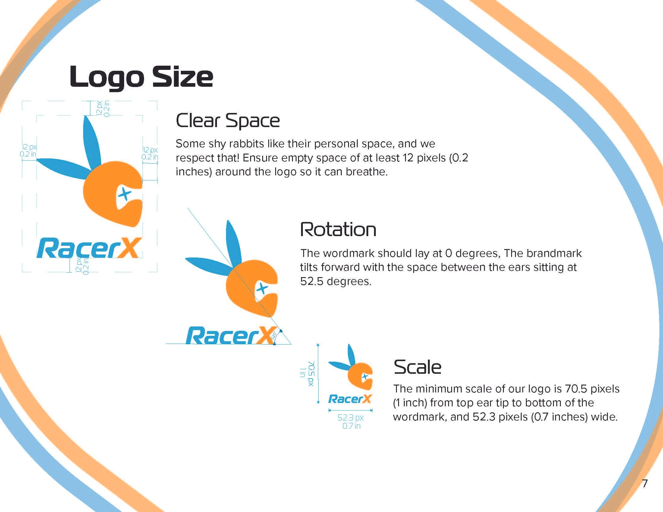
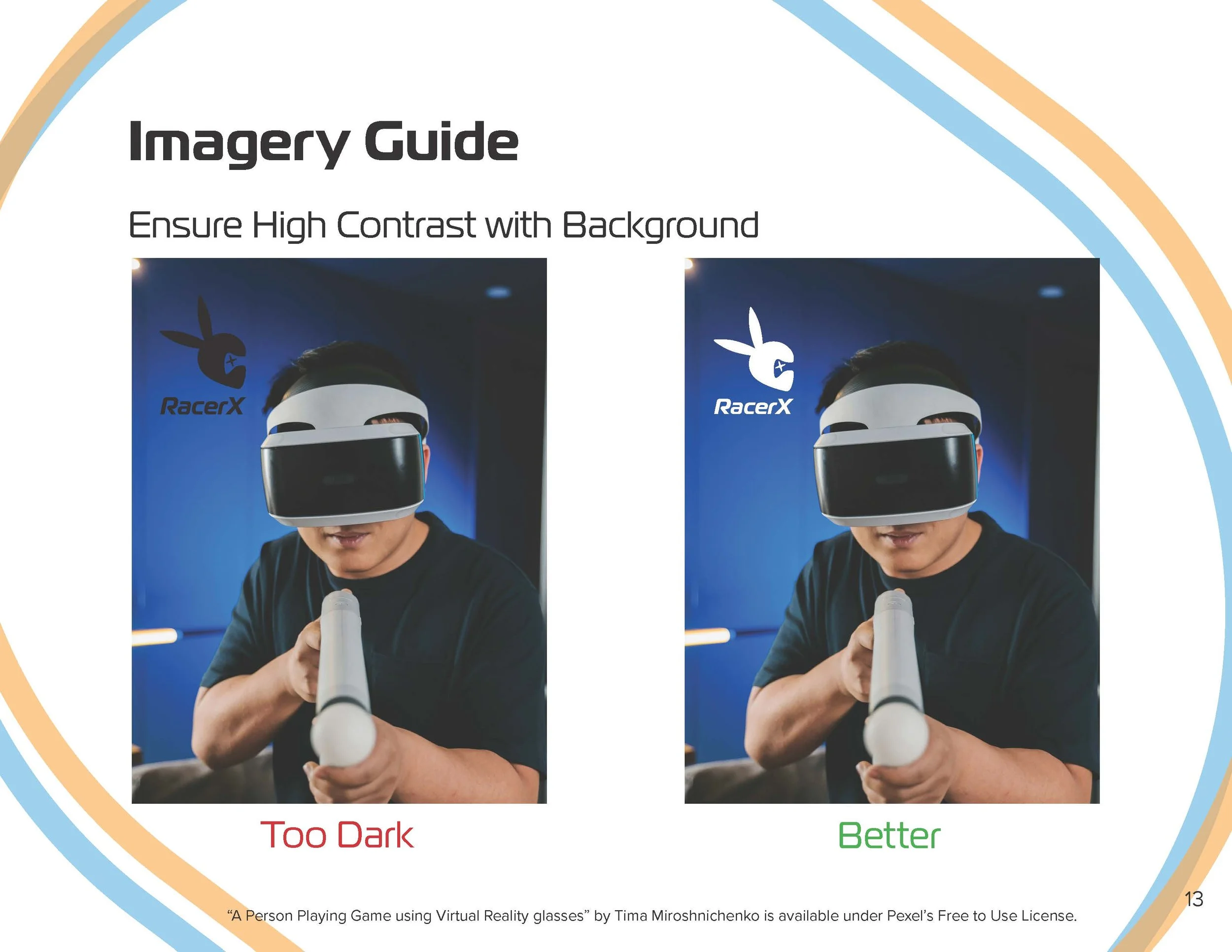
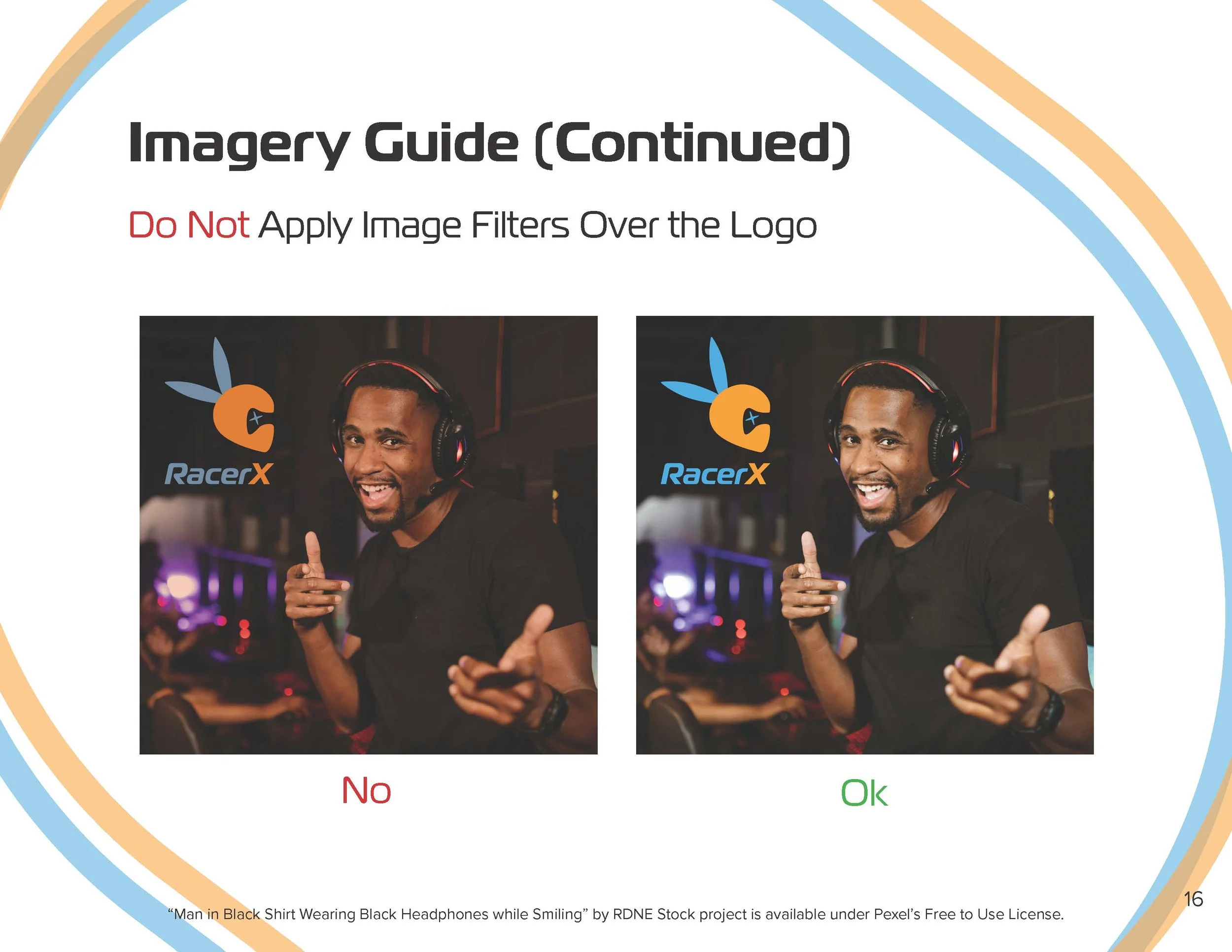
The completed brand guide documents logo variations, color and typography standards, spacing and placement, and examples of correct and incorrect usage—giving future designers and collaborators a framework for maintaining recognition without requiring every application to look identical.
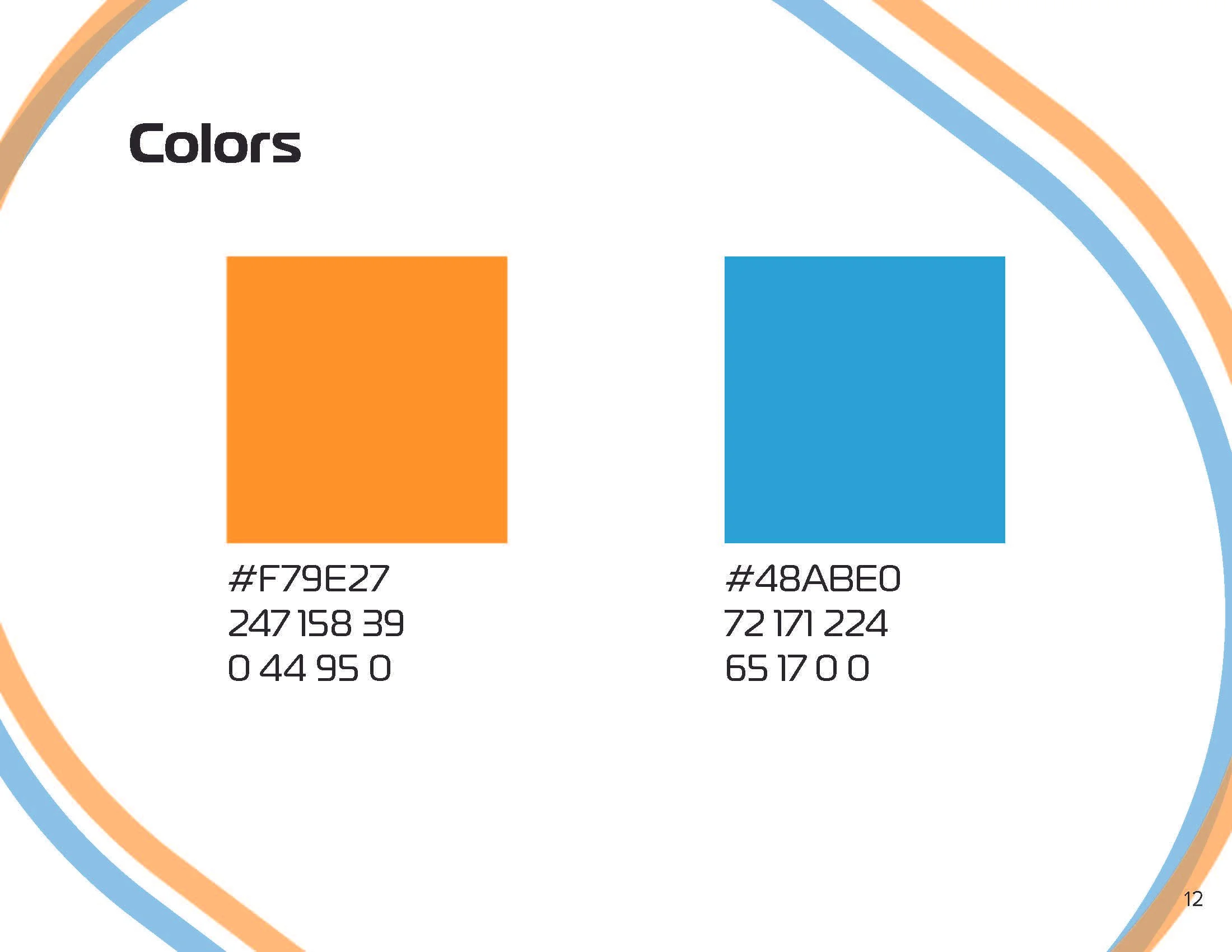
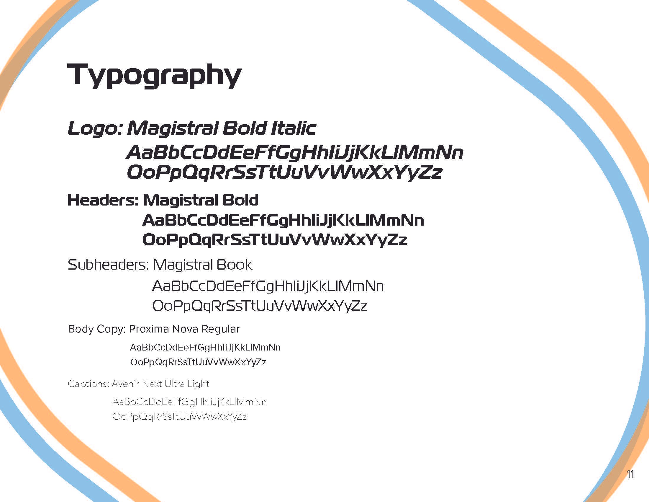
Color · Typography · Placement
Defined color, type, spacing, and placement standards establish the visual rules collaborators need to reproduce the identity consistently.
⟡ Keeping It Consistent
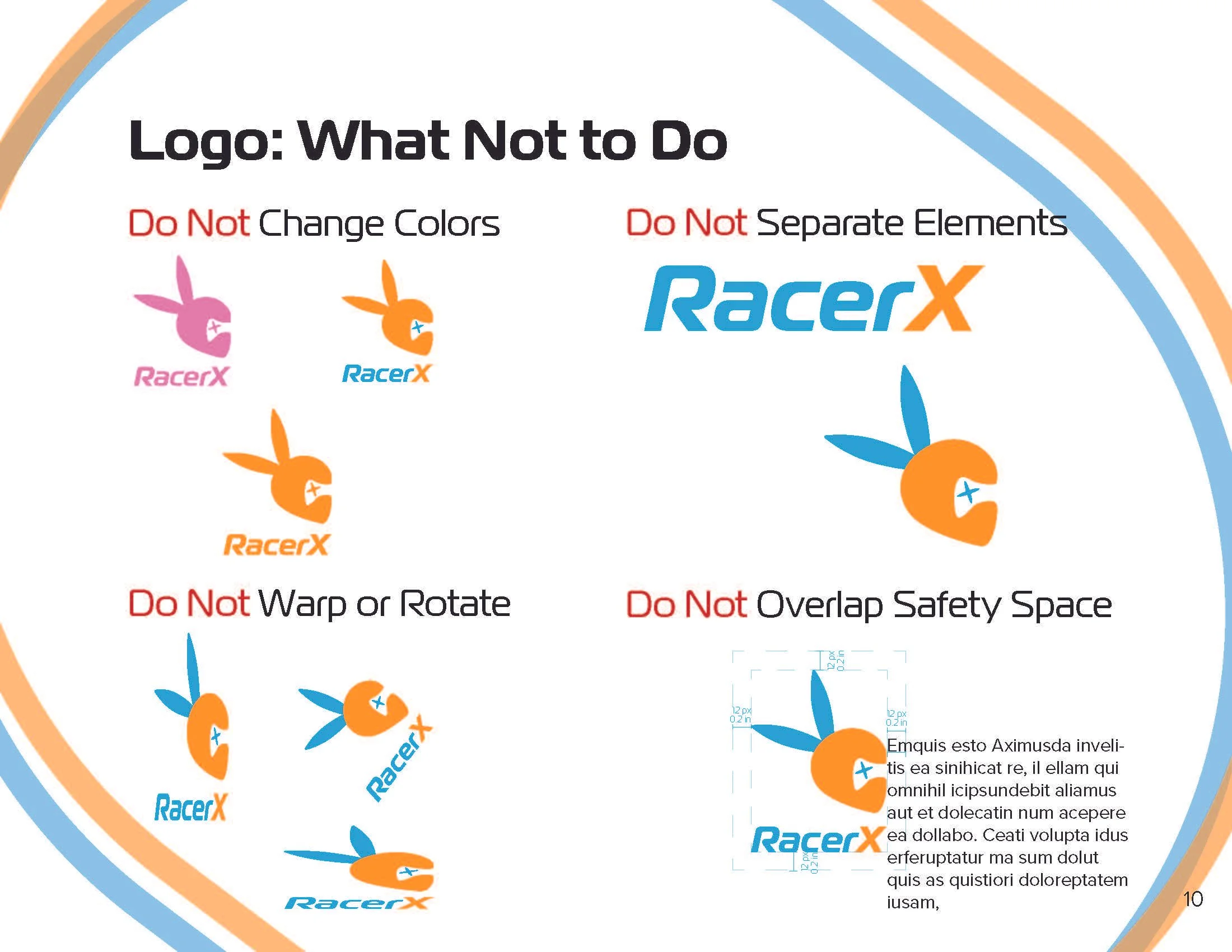
Incorrect Usage
Examples of distortion, unauthorized color changes, and improper placement demonstrate not only how the identity should appear, but which alterations weaken its consistency.
⟡ Protecting the Brand
Built to Stay Recognizable
RacerX challenged me to think beyond the creation of a single logo and consider how an identity functions as a repeatable visual system. Developing the mark from initial concepts through documented usage standards demonstrated how research, refinement, and clear design rules can turn one graphic into a brand story others can consistently use.
Project Note
RacerX is a fictional company developed as part of an academic brand identity brief for GRA260: Designing a Brand Identity at Southern New Hampshire University. All RacerX logo concepts, final identity design, and brand guidelines shown were created by Katie Jacoby.