
Spotlight Center Stage
Bringing the Spotlight to Digital Stages
Project Type: Academic Integrated Marketing Campaign Concept
Role: Graphic & Web Designer
Academic Client: Spotlight Center Stage/GRA 358: Integrated Digital Campaign Design, Southern New Hampshire University
Deliverables: Website Homepage · Email Campaign · Digital Display Ad · Instagram Ad
The Project: Spotlight Center Stage is a fictional community theatre celebrating its tenth season. For this academic campaign, I was provided with an established brand—including its logo, color palette, typography, image library, and “Get in the Spotlight” campaign copy—and challenged to translate that identity into a cohesive digital experience across multiple platforms.
The campaign included a website homepage, email blast, digital display ad, and Instagram ad designed for the theatre’s current patrons, volunteers, families, and potential donors. Across each touchpoint, the work needed to follow digital design best practices while maintaining a consistent identity, message, and call to action.
Campaign Themes & Messaging:
Community: Position Spotlight Center Stage as a place for connection, collaboration, and belonging.
Participation: Build excitement around getting involved both onstage and behind the scenes.
Inclusion: Reinforce the campaign's central idea that there is a role for everyone to “Get in the Spotlight.”
The Goals:
Raise awareness of Spotlight Center Stage and its tenth anniversary season.
Drive meaningful audience action through volunteer sign-ups, season ticket purchases, and donations.
Create a consistent digital journey from initial campaign exposure to engagement on the theatre's website.
The Challenges:
Translate an established brand across multiple digital formats, maintaining visual consistency while adapting hierarchy, layout, and content to the requirements of each platform.
Bring the “Get in the Spotlight” message to life, creating a campaign that feels energetic, welcoming, and participatory while following digital design and usability best practices.
Speak to multiple audiences through one campaign, balancing the needs of existing patrons, prospective volunteers, families, and potential donors without fragmenting the brand or message.
Setting the Stage
The client-provided brand elements gave the campaign an established visual identity from the start. My role was to direct that existing “cast” of colors, imagery, and typography into new arrangements that could communicate the campaign’s central themes: community, collaboration, inclusion, and excitement.
To maintain consistency across all four digital deliverables without simply repeating the same design, I established a few guiding principles:
Color: Use the brand’s bright yellows and reds to create energy, excitement, and visual emphasis, balanced by high-contrast navy and white for backgrounds, text, and overall clarity.
Imagery: Prioritize images featuring two or more people actively participating in theatre to reinforce collaboration, community, and involvement. Exceptions were made when a single-subject image directly supported adjacent copy or allowed the viewer to imagine themselves in the “spotlight.”
Typography: Reserve the brand’s decorative display typeface for short headlines and calls to action, while using its simpler sans serif for longer copy to maintain legibility across digital screens and support web-design best practices.
Asset Note: Brand identity elements and campaign copy were provided as part of the academic brief. Select stock photography was sourced by the academic brief creator from Pexels and Pixabay under their respective licenses. All layout, image selection, visual hierarchy, and campaign applications shown in the following sections were designed by Katie Jacoby.
Same Spotlight. Different Stages.
⟡ Digital Display Ad
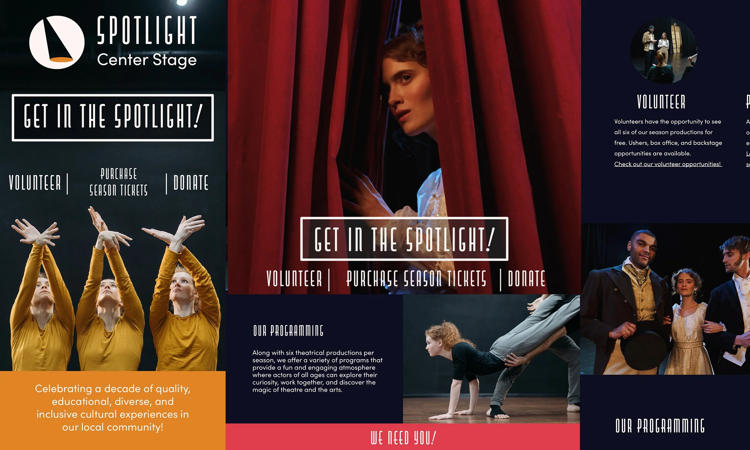
The vertical digital display ad was one of my earliest opportunities to put the campaign’s visual rules into practice. With limited space and only moments to capture attention, the design needed to communicate the “Get in the Spotlight” message quickly while directing viewers toward three ways to participate: volunteer, purchase season tickets, or donate.
Image
I selected a photograph of three performers actively engaged in theatre, reinforcing the campaign’s themes of collaboration, community, and participation. Their gold costumes closely match the brand palette without additional manipulation, while their upward-reaching poses and illuminated faces—quite literally in the spotlight—bring energy and movement to the composition.
Color & Composition
The performers’ outstretched arms naturally lead the eye toward the dark negative space above, creating an ideal home for the high-contrast white logo and campaign message. Repeated gold accents—from the logo to the performers’ costumes to the information block below—help carry the eye vertically through the ad and connect its individual elements into one cohesive composition.
Information Hierarchy
“Get in the Spotlight!” receives the strongest typographic treatment, using the brand’s decorative display typeface and additional framing to establish it as the campaign’s primary message. The three participation pathways—Volunteer, Purchase Season Tickets, and Donate—receive secondary emphasis, while supporting copy remains clearly legible without competing for attention.
⟡ Email Campaign Design
The vertical composition established in the digital display ad provided a natural starting point for the email campaign, but the expanded format allowed me to introduce additional messaging, imagery, and calls to action while maintaining the same visual strategy.
Expanding the Visual Language
The email introduces the brand’s red as a prominent accent, reinforcing the urgency of “We need your support!” while adding another layer of visual energy to the established yellow, navy, and white palette. Alternating blocks of copy and imagery create rhythm down the page and guide readers through the three primary ways to participate—Volunteer, Purchase Season Tickets, and Donate—before culminating in the campaign’s central “Get in the Spotlight” call to action.
The three performers from the digital display ad return at the top of the email, this time cropped so their upward-reaching arms direct attention toward the Spotlight Center Stage logo. Reusing the image creates immediate continuity between campaign touchpoints while adapting its composition to a new purpose.
Matching Image to Message
Each section pairs its call to action with imagery selected to reinforce the specific audience and message:
Volunteer: An image of collaborators working together onstage visually supports the invitation to participate behind the scenes while naturally complementing the brand’s color palette.
Purchase Season Tickets: Performers in period costume showcase the “theatre magic” audiences can experience from their seats, shifting the focus from participating in the work to enjoying the finished production.
Donate: A young performer in a red costume looks directly toward copy highlighting the Youth Summer Theatre Program, visually connecting the organization’s fundraising appeal to the young artists those contributions can support.
⟡ Instagram Ad
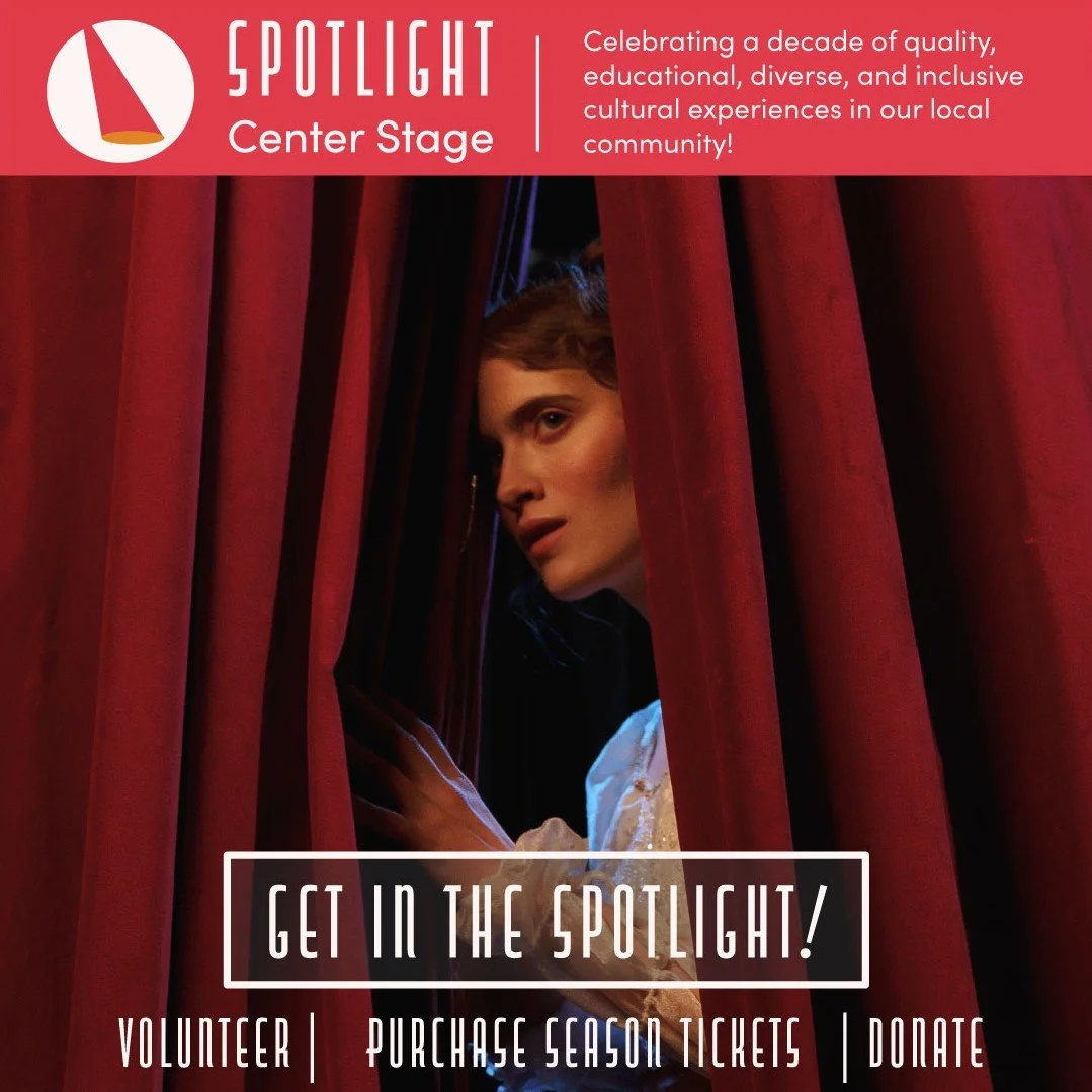
The limited space of a standard Instagram post required the campaign to be distilled to its essentials: who, what, why, and how—all within a fast-moving, visually crowded environment where the design first had to earn the viewer’s attention.
Stopping the Scroll
Red takes on a more prominent role here, highlighting the Spotlight Center Stage logo and introductory copy at the top of the post so viewers can quickly identify who is speaking and why the message matters.
At the center, I selected an image of an actress peeking through stage curtains. The composition fits naturally within Instagram’s square format, but its visual character also stands apart from the casual imagery typical of a social feed. Her spotlighted face, deep shadows, and contrasting blue stage light create a sense of theatrical mystery and anticipation—using the drama of the medium itself to interrupt the scroll.
From Message to Action
The campaign’s primary “Get in the Spotlight” call to action returns within the framing device established in the earlier designs, maintaining recognition across campaign touchpoints. Immediately below, the three participation pathways—Volunteer, Purchase Season Tickets, and Donate—answer the final question: how can I get involved?
With less room for supporting information, the Instagram ad relies on strong hierarchy, concise messaging, and an arresting image to move the viewer quickly from brand to message to action.
⟡ Website Homepage
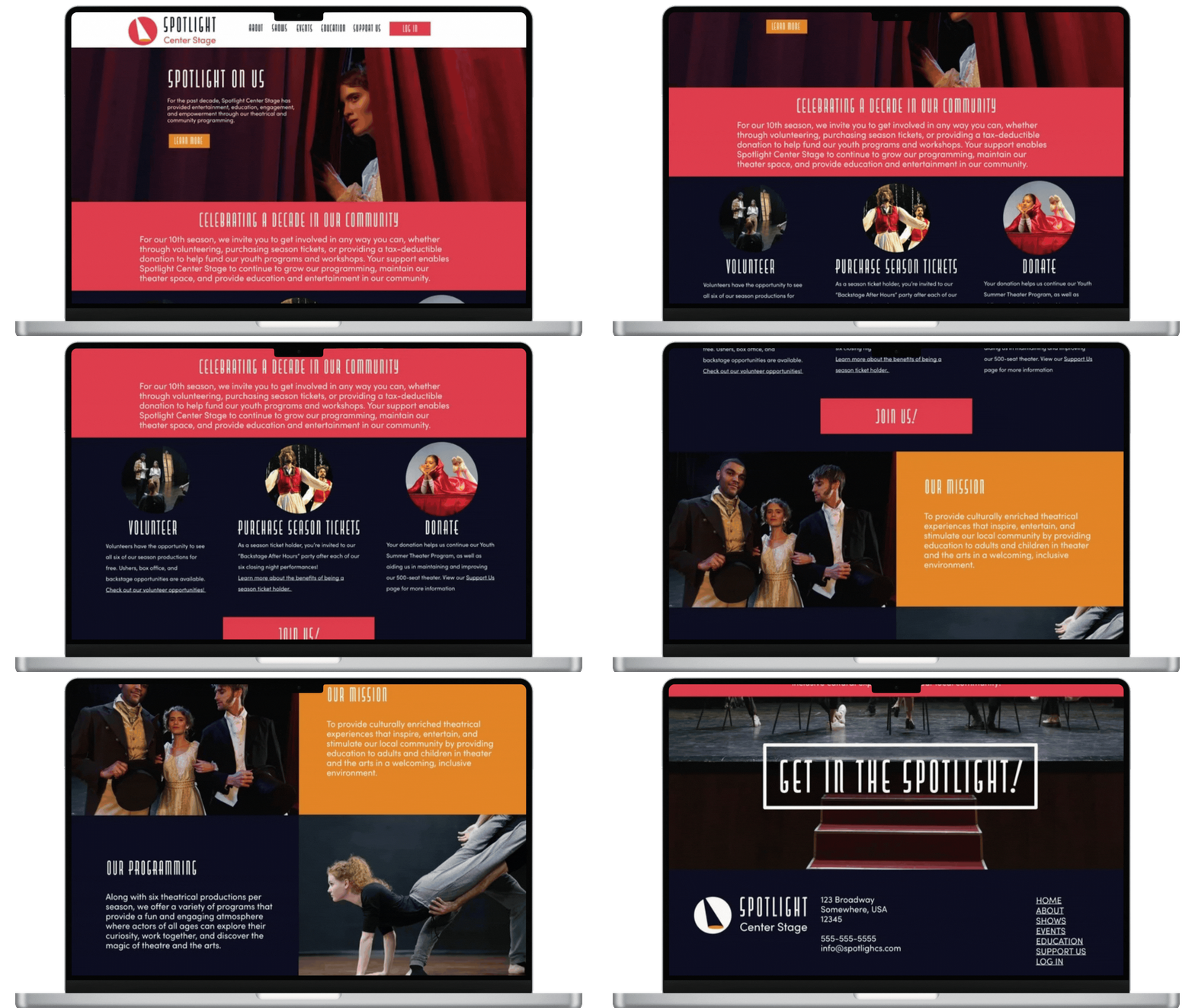
The page is visually framed as a theatrical journey: the curtain opens at the top, and the visitor is invited onto the stage at the bottom.
As the campaign’s most information-rich touchpoint, the Spotlight Center Stage homepage needed to do more than capture attention—it needed to give that attention somewhere to go. I designed the page as the central destination for the campaign, balancing the immediate “Get in the Spotlight” message with clear navigation, multiple audience pathways, and enough organizational context to build trust with first-time visitors.
Building a Clear Audience Journey
The navigation follows familiar web conventions to make the site immediately intuitive: the full-color Spotlight Center Stage logo anchors the upper left, while clearly labeled links organize the theatre’s primary offerings and resources. About appears first to orient new visitors, followed by Shows and Events as the theatre’s core audience-facing offerings, then Education and Support Us for additional programming and giving opportunities. A contrasting Log In button sits at the far right, giving returning patrons and members a distinct pathway to account-related content.
Throughout the page, I prioritized clear information hierarchy and legibility, using the brand’s decorative typeface selectively for headlines and calls to action while relying on its simpler sans serif for longer copy.
Bringing the Campaign Home
The hero reintroduces the actress peeking through the curtains from the Instagram ad, creating immediate recognition between campaign touchpoints. A navy gradient over the red curtain increases contrast and readability for the headline and supporting copy, while a yellow “Learn More” button gives curious visitors a clear next step.
From there, the campaign message transitions into the three primary participation pathways established across the other deliverables: Volunteer, Purchase Season Tickets, and Donate. Each is paired with theatre imagery and arranged horizontally, echoing the visual structure of the display and Instagram ads. Circular image crops reference both the spotlight in the organization’s logo and the literal pools of light found onstage, extending the brand concept beyond color and typography into the page’s visual language.
Designing for Exploration
I adjusted the order of content from the provided brief to create a more intuitive progression through the organization’s story. Rather than immediately asking unfamiliar visitors to act, the page introduces Spotlight Center Stage’s mission and programming first—providing context and establishing trust before returning to a stronger call for participation near the bottom of the page.
Alternating imagery and text carries forward the visual rhythm established in the email campaign while making longer sections easier to scan. Repeated uses of the campaign’s red create emphasis around moments of urgency and participation, while yellow calls to action provide high-contrast points of interaction.
Turning the Page Into a Stage
The final “Get in the Spotlight!” call to action brings the campaign’s visual and narrative ideas together. An image of stairs leading directly onto a stage places the viewer at the threshold of the action: all that remains is to step up and join.
That image also creates a visual bookend with the curtain imagery at the top of the page. The hero opens the curtain; the content between introduces the people, mission, programs, and opportunities that make Spotlight Center Stage a community; and the final image invites the viewer onto the stage themselves.
In that sense, the homepage became its own small theatrical journey—with each content section functioning like another moment in the story and the final call to action giving the audience a role to play.
Final Bows
Across four very different digital environments, the campaign maintains the same visual identity, message, and calls to action without relying on the same layout. Each touchpoint adapts to how its audience encounters it: the display ad captures attention, the email guides attention toward action, Instagram interrupts the scroll, and the website turns interest into exploration and choice.
Spotlight Center Stage reinforced for me that consistency doesn't mean sameness. A successful integrated campaign gives each platform room to do its own job while ensuring every piece still feels unmistakably part of the same story.
Working on a campaign for an organization rooted in an industry so close to my heart made this project especially rewarding. It also reinforced something that continues to shape my creative work: my experience in theatre and storytelling naturally informs how I think about audience, visual communication, and the journey from capturing attention to inspiring action.